WordPress Block Editor – Block Settings: Color
 This tutorial is part of our series on using common block settings in the WordPress Block Editor Settings Section.
In this tutorial, you will learn how to customize a block’s color settings.
For a complete understanding of how to use the WordPress Block Editor, see the other tutorials in this series:
- WordPress Block Editor: Block Settings
- How To Use The WordPress Block Settings Section
- How To Use WordPress Blocks
***
Block Settings – Color
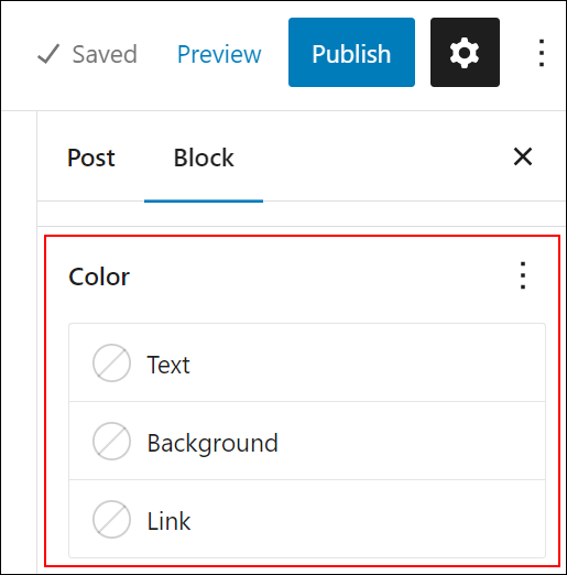
Many types of blocks allow you to customize and edit their color settings.
![]()
Note: Block types that support color properties must be selected in the content editor area to display the Color settings in the Block Settings panel.
If you need help using block settings, see this tutorial: WordPress Block Editor: Block Settings
Color Properties
You can edit and customize settings and options for the following properties in blocks that support color:
- Text – Set the color of the selected text.
- Background – Set the background color of the selected block.
- Link – Set the color of links in the selected block
Global Color Settings
You can also apply global style settings to your site’s color schemes and palettes and change the default color of different global elements on your site, such as:
- Body text
- Backgrounds
- Links
- Captions
- Buttons
- Headings
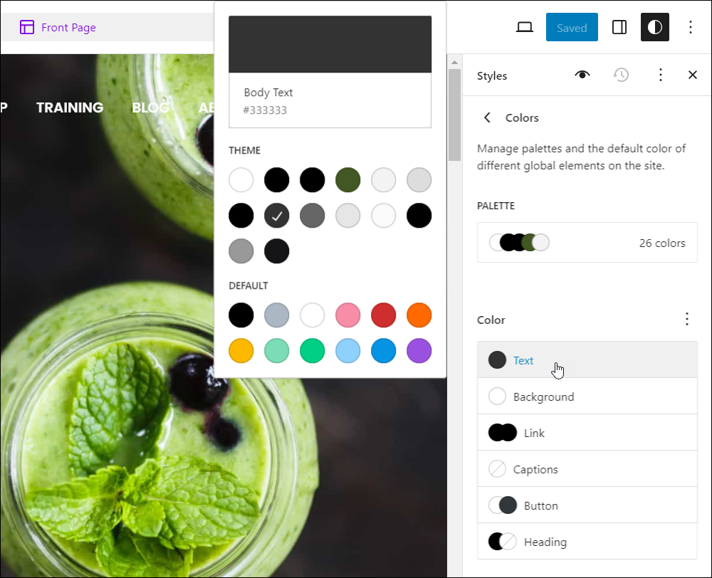
To learn more about changing global color styles, see this tutorial: WordPress Block Settings: Styles
Additionally, WordPress gives you control of your block’s color settings by providing a color picker tool with the three main color models used to define color in web content: RGB, HSL, and Hex.
- Hexadecimal (Hex) is a color model that represents colors using a combination of six hexadecimal digits (0-9 and A-F) that represent the intensity of each of the three primary colors in the RGB model. Each pair of digits represents the intensity of one of the primary colors, with the first two digits representing red, the middle two digits representing green, and the last two digits representing blue. For example, pure red would be represented as #FF0000, while pure green would be #00FF00 and pure blue would be #0000FF.
- RGB stands for Red Green Blue, which is an additive color model that describes how different combinations of red, green, and blue light can create different colors. In this model, each color is represented by three numbers that range from 0 to 255, which correspond to the intensity of each of the primary colors. For example, pure red would be represented as (255, 0, 0), while pure green would be (0, 255, 0) and pure blue would be (0, 0, 255).
- HSL stands for Hue Saturation Lightness, which is a color model that describes how colors can be represented by their hue (the color itself), saturation (how much of the color is present), and lightness (how bright or dark the color is). In this model, each color is represented by three values: a hue value (from 0 to 360 degrees), a saturation value (from 0 to 100%), and a lightness value (from 0 to 100%). For example, a bright red color might be represented as (0, 100%, 50%), where the hue value of 0 degrees represents pure red, the saturation value of 100% represents full intensity, and the lightness value of 50% represents a medium level of brightness.
Notes:
- The WordPress color picker tool uses the RGBA color model (an extension of the RGB color model), and the HSLA color model (an extension of the HSL color model), where the “A” stands for Alpha.
- In both the RGBA and HSLA color models, each color is represented by four values: the three values of RGB or HSL, and an Alpha value, which represents the opacity or transparency of the color.
- Alpha values range from 0 to 100, where 0 represents complete transparency (the color is completely invisible) and 100 represents complete opacity (the color is completely visible). When the Alpha value is set to 50, for example, the color is partially transparent, and anything behind it will show through to some extent.
- This extended color model is used in web design to create a transparent or semi-transparent background color for an element on a webpage without obstructing the content behind it, like an image watermark.
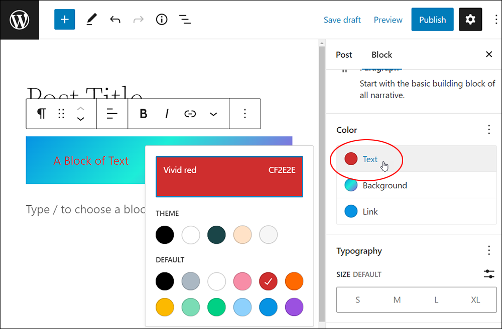
- Every color displayed in the color picker tool has a name and a color code (Hex).
In the example below, the selected text color is Vivid red and its color code (or Hex code) is CF2E2E.
![]()
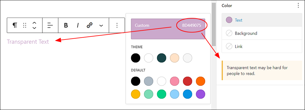
If you create a color using a different color model like RGBA, the color name will show up as “Custom” and the Hex code will be longer than 6 digits to accommodate the opacity of the color settings.
In the screenshot below for example, you can see that creating transparent text is possible (e.g. using the RGBA color model), but you will see a warning displayed that “Transparent text may be hard for people to read.” Use this option wisely.
Color Settings
The tutorial below shows you how to customize and edit the default settings in blocks that support colors, including using the color picker tool to specify colors using different color models and color selectors.
Note: A block’s color settings may include additional options depending on which blocks you select and what plugins and themes are installed on your site.
Color Settings: Text
To set the text color of a block:
- Select the block
- Select the Block settings panel to view the Color settings option
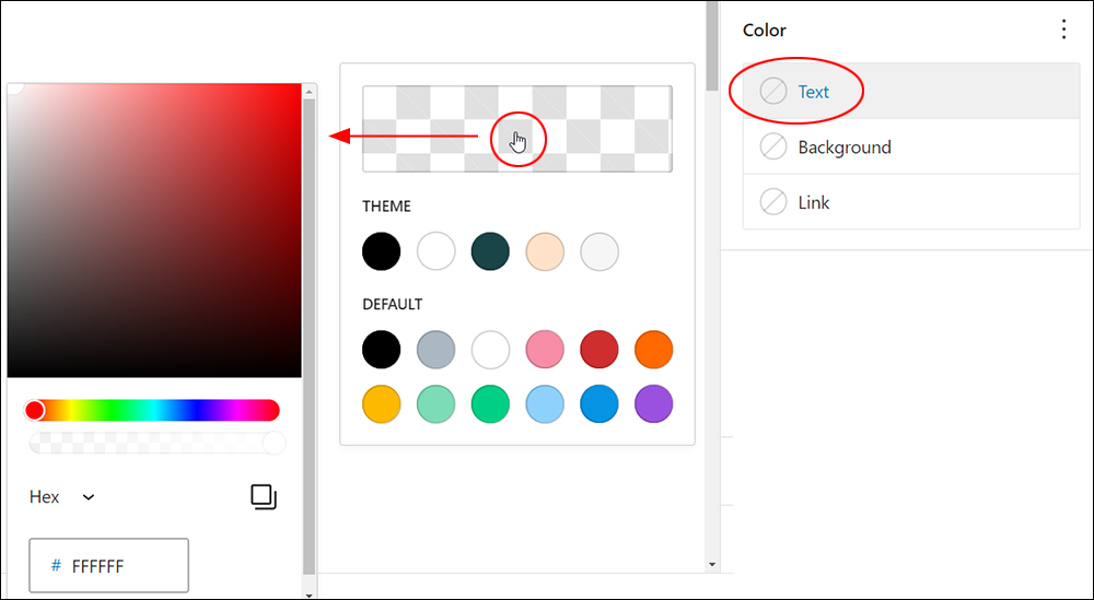
- Click on Text.
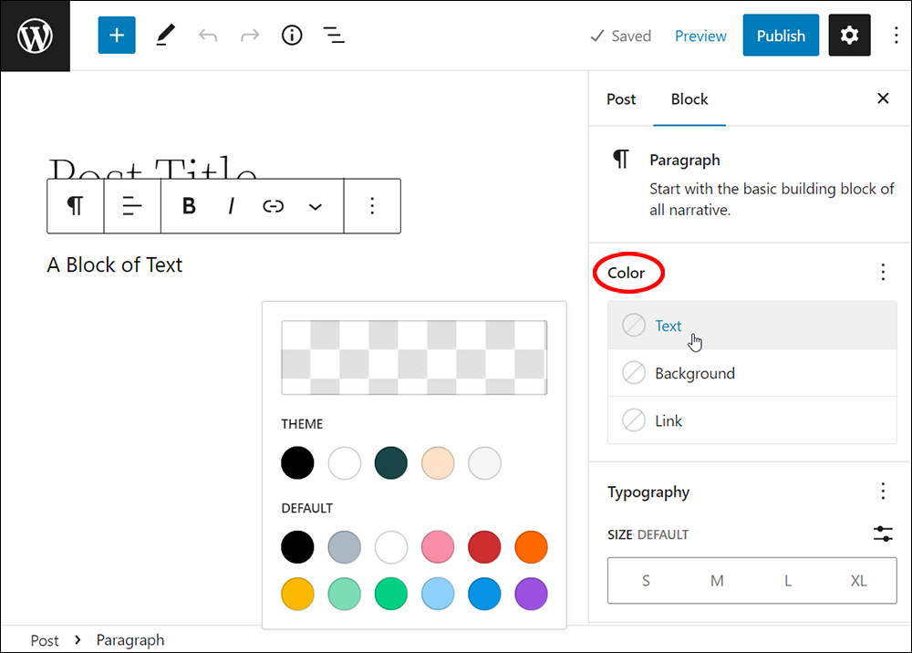
A pop-up panel containing the following options will display:
- Color Picker – allows you to specify the color of your choice using the built-in color picker.
- Theme Color Palette – displays colors from the color palette associated with your active theme. Note that many newer block themes let you easily change their entire color palette, which affects the color options displayed in the Theme section of the popup panel.
- Default – displays default colors set by the WordPress software installation on your site.
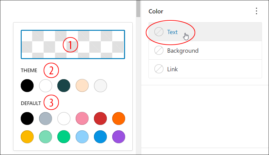
Clicking on the transparent rectangle area brings up the Color Picker.
Use the color picker to select a color by dragging your cursor over the color fields or by entering a value in the color properties field.
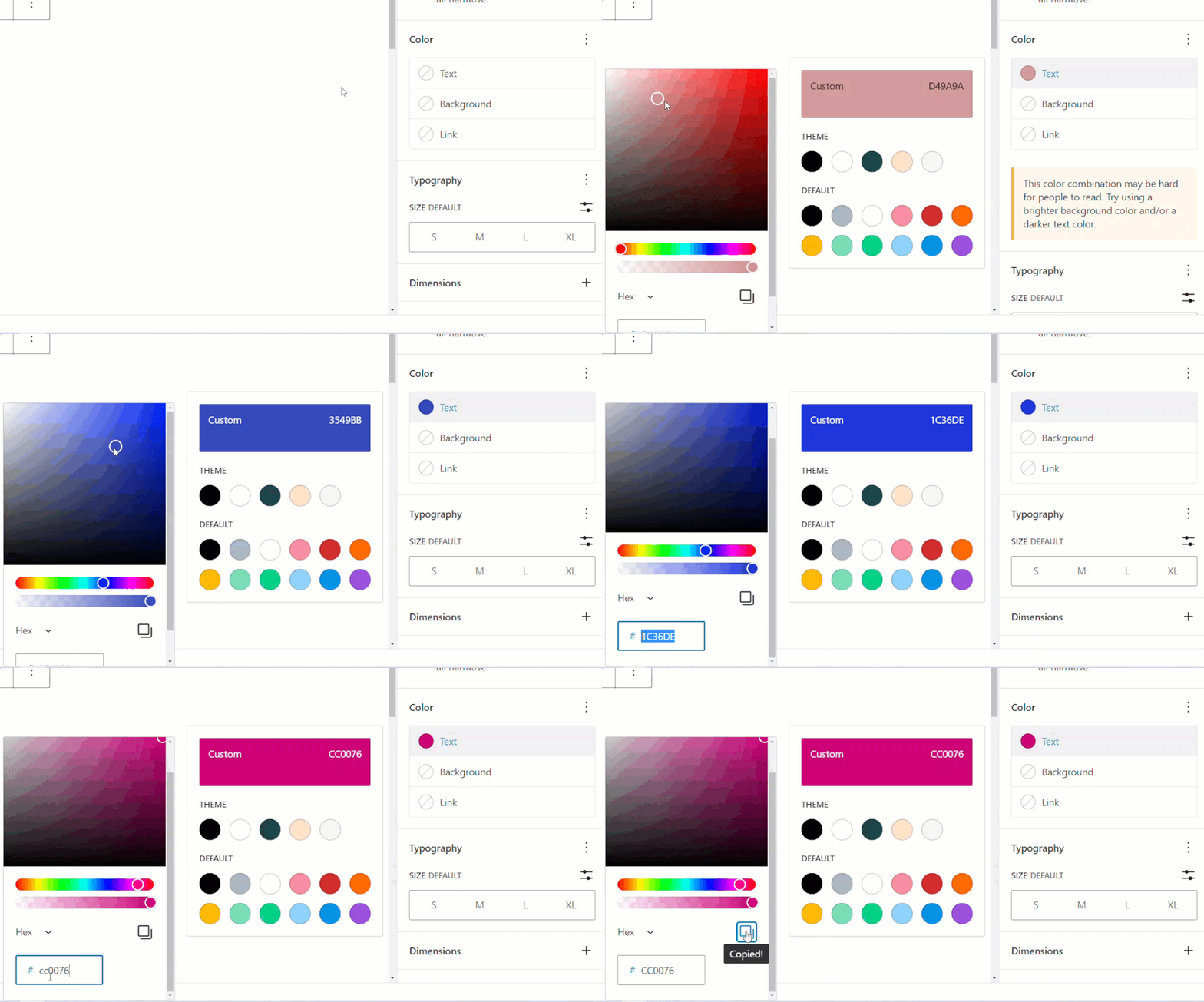
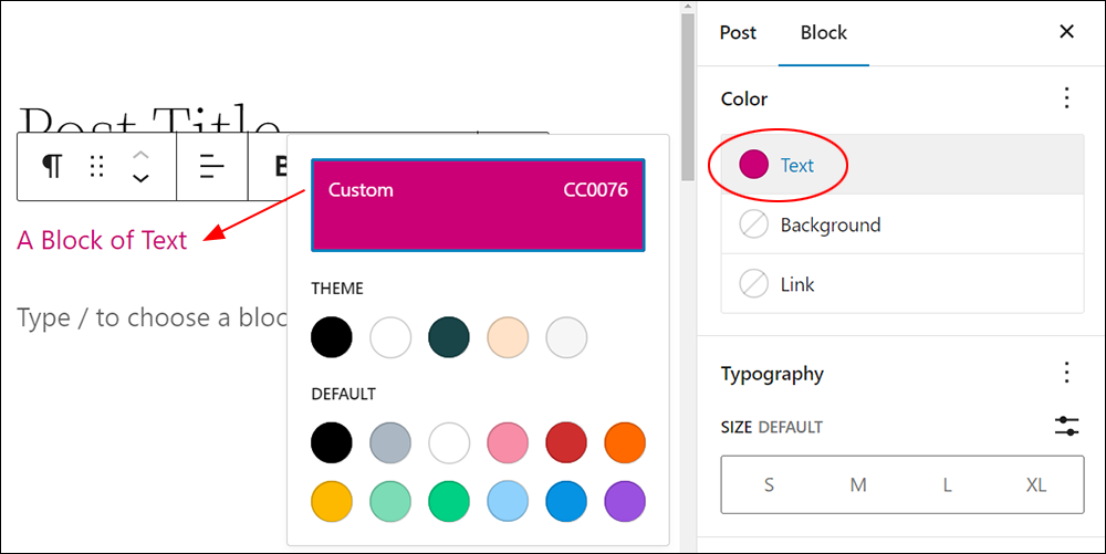
The rectangle will be filled with your chosen color and the color of your text will be changed accordingly.
Instead of using the color picker, you can also simply select one of the color options from either the Theme or Default palette.
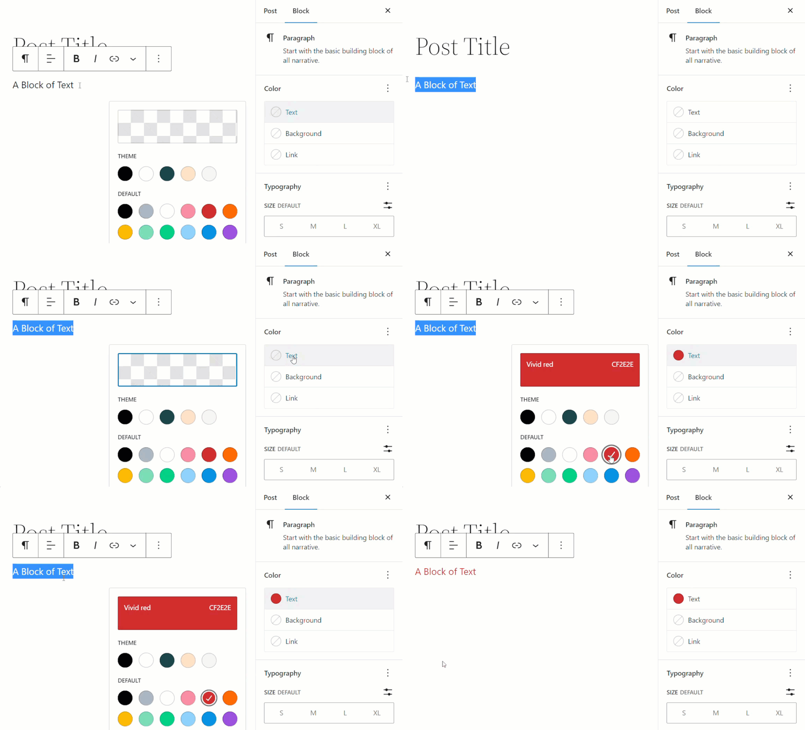
Note: You don’t need to select the text in a block to change the text color. Simply select the block, choose a color, and it will be automatically applied to the block’s text.
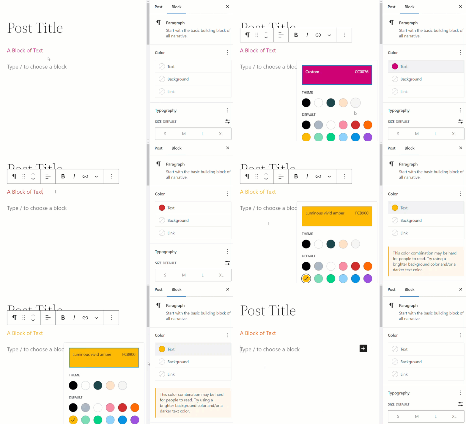
Remember to save your work after making changes to update your block’s color settings.
Note: It is currently not possible to change the text color for individual words or letters in a block using the block’s Color settings, as these settings apply globally to the entire block.
As an example, to create this multicolored word… Chameleon
You would need to use either the Custom HTML block or compose your content in the WordPress Classic Editor.

Color Settings: Background
You can change the background color of a block that supports color options by selecting Background in the Color settings box.
To select the Background option:
- Select the block
- Select the Block settings panel to view the Color settings option
- Click on Background.
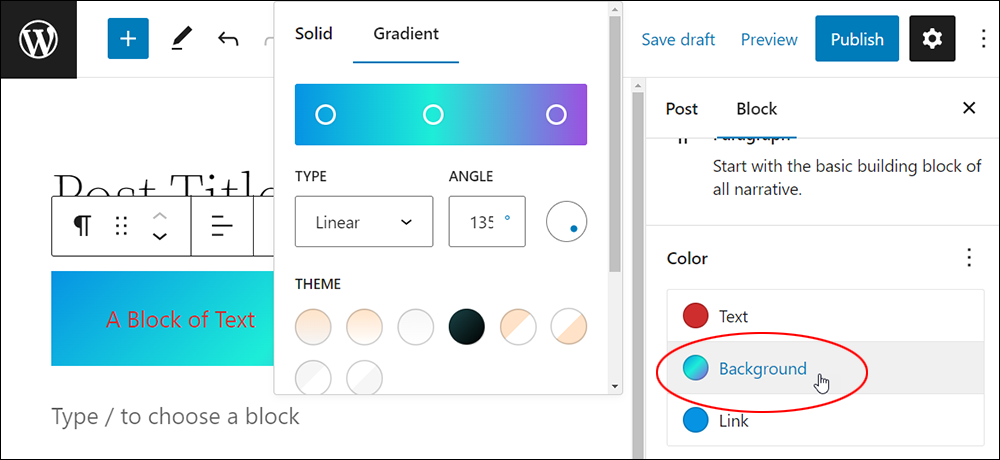
Selecting the Background setting gives you a choice of using a Solid background color or adding a Gradient.
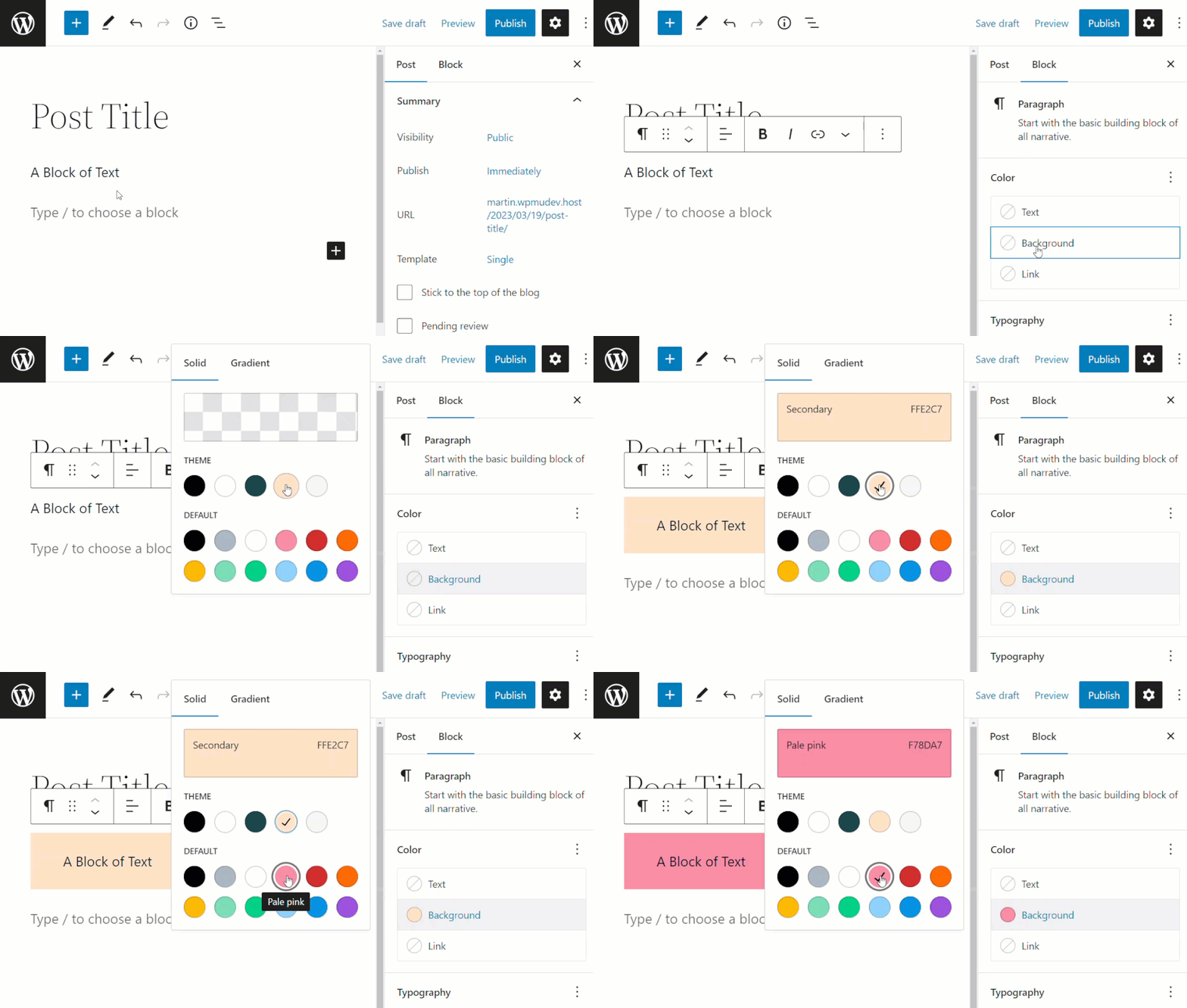
Adding A Solid Background Color To A Block
To add a solid background color to a block:
- Select the block you want to add a background color to in the content editor.
- Switch to the Block settings panel to view the Color settings box.
- Click on Background in the Color settings.
- Select the Solid tab in the Color panel pop-up window.
- Choose a solid color background from either the Theme or the Default color palettes.
- A solid-colored background will be applied to your selected block.
Note: If WordPress detects accessibility issues with the color you have selected, it will display the following warning message: “This color combination may be hard for people to read. Try using a brighter background color and/or a darker text color.”
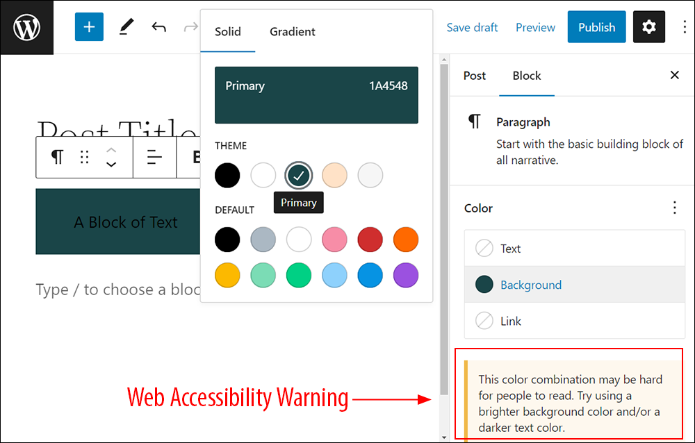
If you see this warning, consider choosing colors that will be easier for users to read.
Adding A Gradient Background To A Block
To add a gradient background to a block:
- Select the block to add color to in the content editor.
- Switch to the Block settings panel to view the Color settings box.
- Click on Background in the Color settings box.
- Select the Gradient tab in the Color panel pop-up window.
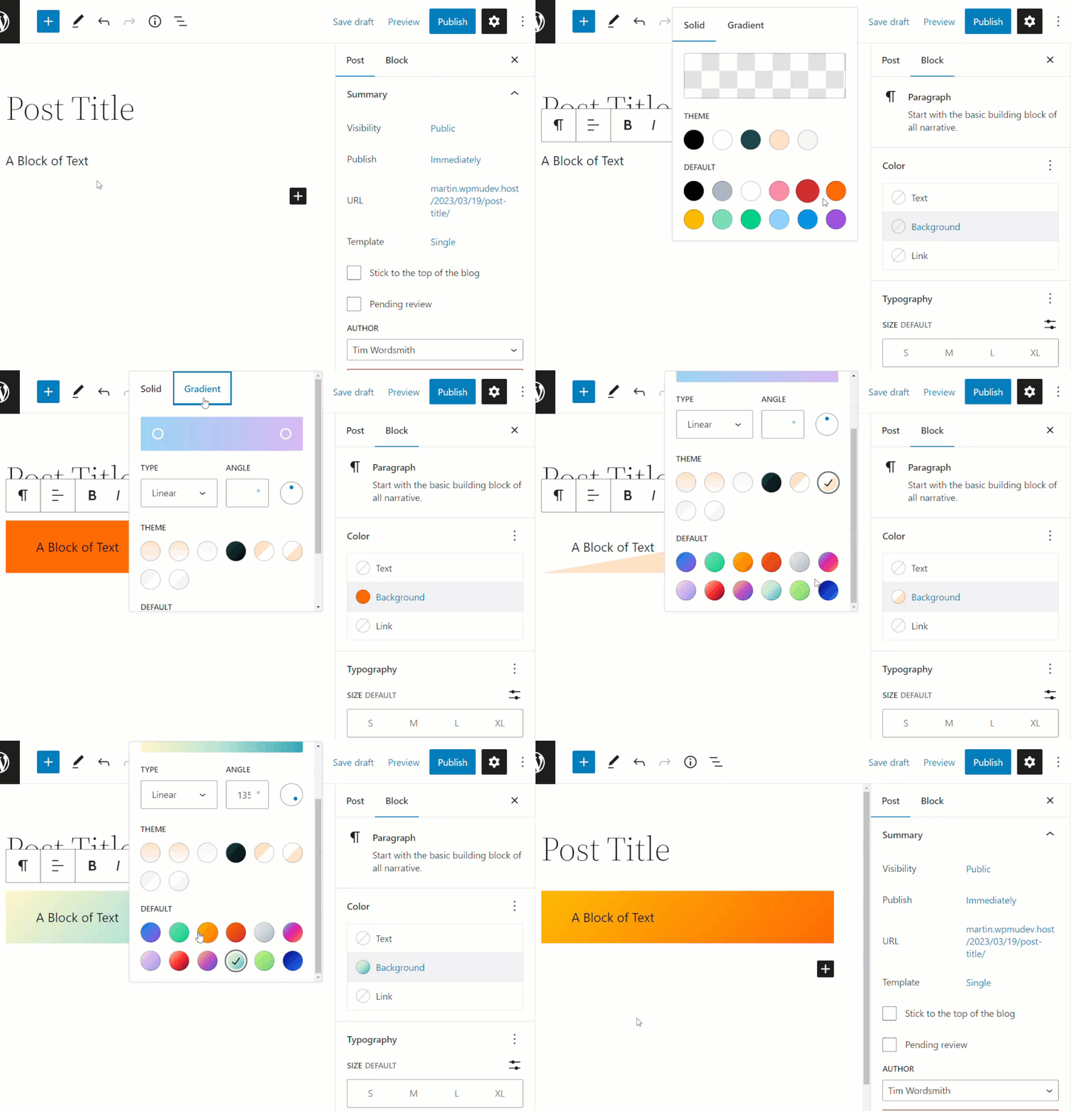
- Create your own Gradient using the sliders in the color picker and choosing the Gradient Type (Linear or Radial), or choose a gradient background from either the Theme or the Default color palettes.
- A gradient background will be applied to your selected block.
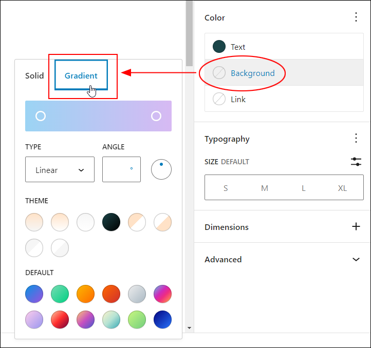
The color picker gives you precise control over your gradient’s colors.
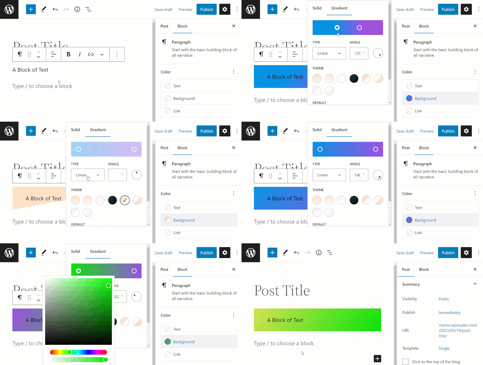
You can choose colors using the sliders and fine-tune these using additional options, such as the Gradient Type (Linear or Radial).
Notes:
Selecting the following Gradient Type:
- Linear – lets you specify the gradient angle by either inputting a value into the Angle field or by adjusting the angle dial button.
- Radial – lets you move the sliders in or out to adjust your radial gradient effect.
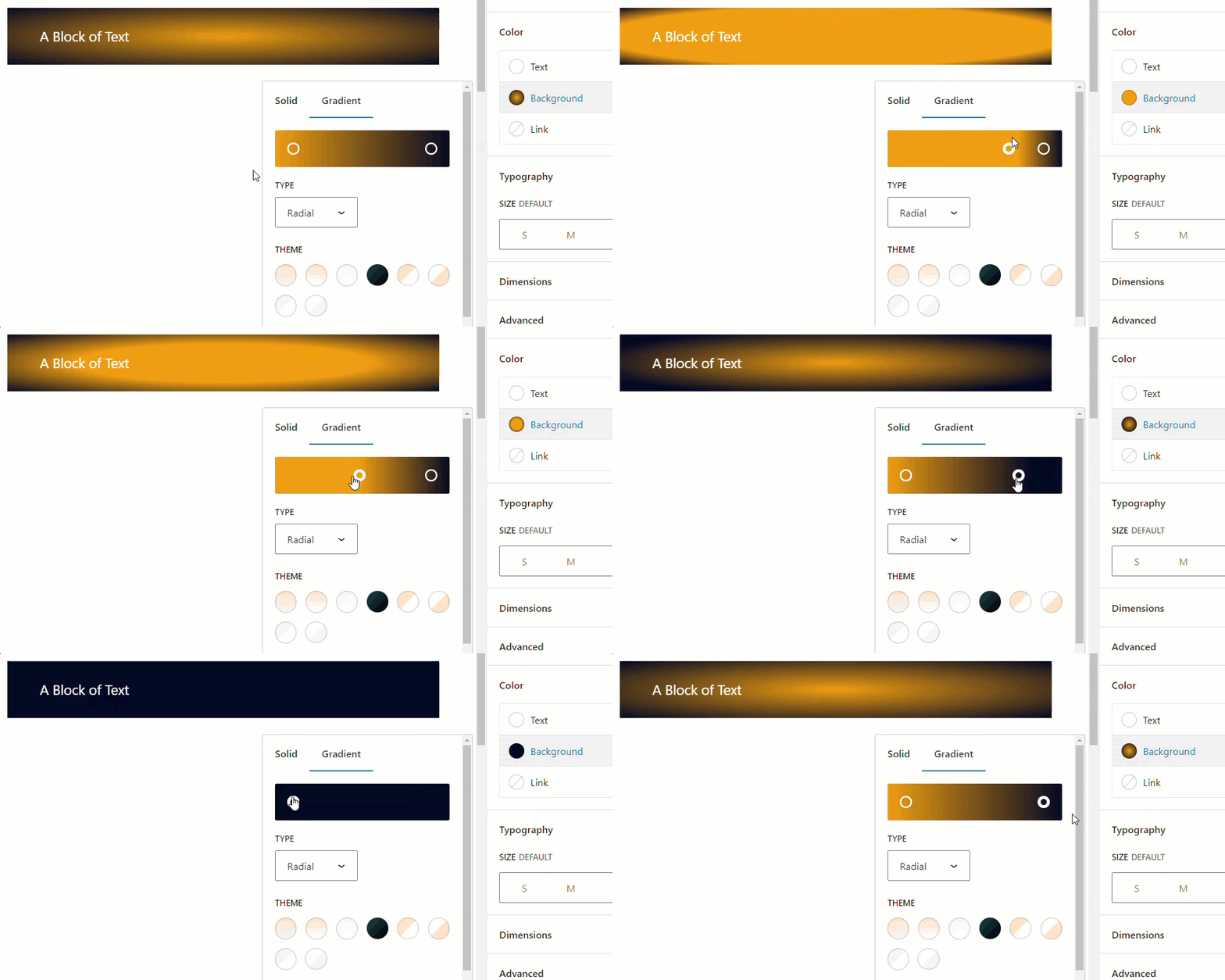
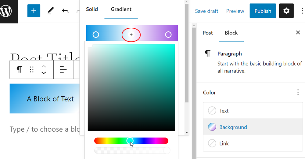
You can also add multiple control points to gradients to create a multicolored gradient background for your block.
Just click on the Gradient tool to add a new control point to your gradient.
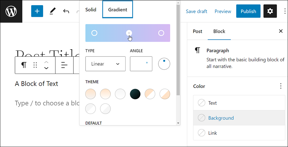
You can create eye-catching multicolored gradients by adding multiple points to the gradient tool and adjusting your color settings.

There are a number of ways to adjust and finetune your gradients.
For example, you can choose the Gradient Type you want for your gradient and adjust settings like slider spacing, angles, etc.
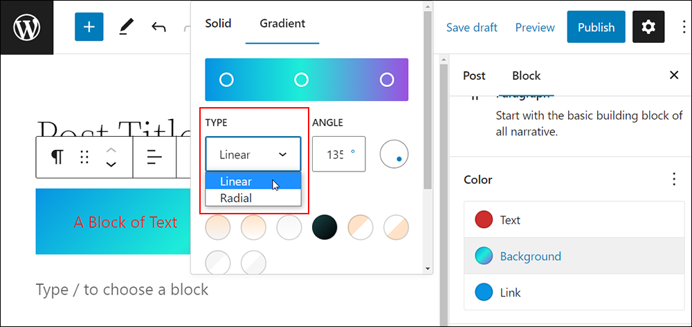
Adjust the angles of your gradient using the gradient value field or dial feature (or a combination of both).
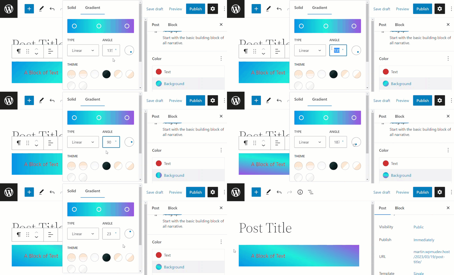
As shown in the image below, adjusting the angle of a gradient affects the entire gradient, not its individual control points. You can preview your changes in real time.
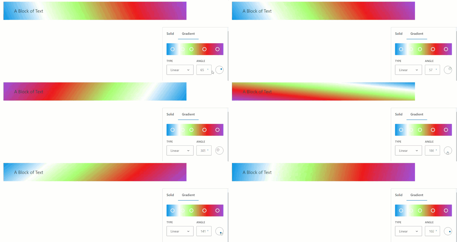
You can also use the color picker to edit and adjust the color of your newly added gradient point.
Simply click on a control point and adjust the settings.
You can also use different color systems to select your gradient colors using the dropdown menu.
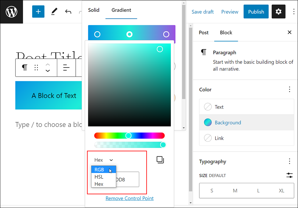
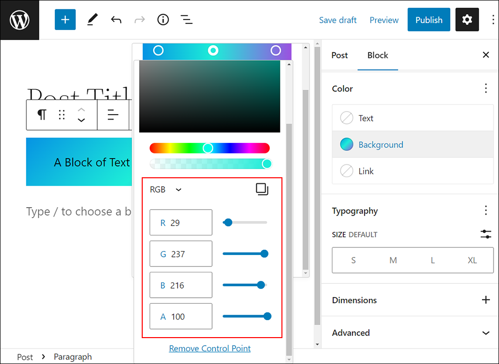
For example, if you choose RGB (Red, Green, and Blue), enter values from 0-255 into each of the fields or adjust the sliders to create the color.
As mentioned earlier, the WordPress Color settings tool uses the RGBA color model (Red, Green, Blue, Alpha), where A sets the opacity on a scale of 0 (full transparency) to 100 (full opacity)
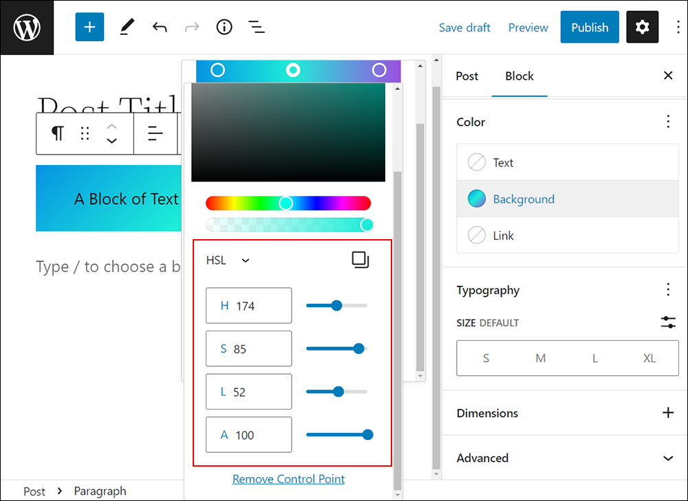
Similarly, enter values into each of the fields or adjust the sliders to create a color if you choose the HSL (Hue, Saturation, and Lightness) color model. Use “A” (Alpha) to adjust the opacity.
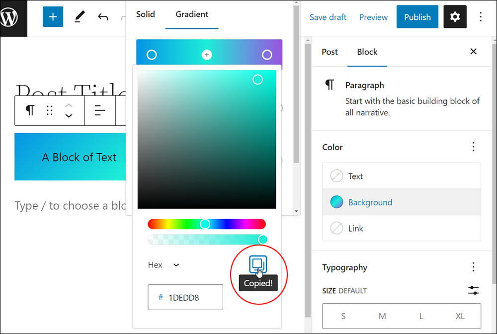
You can also copy the color values to your clipboard using the Copy button.
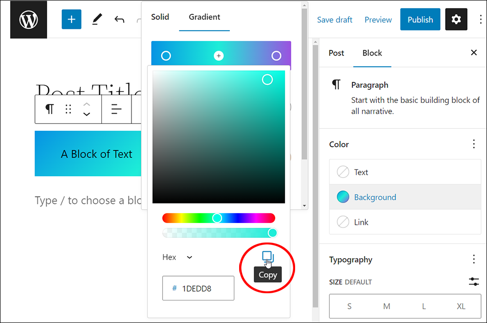
The function to copy and paste color values is useful if you want to duplicate colors across different blocks, create a branding guide for your team, communicate color choices with designers, etc.
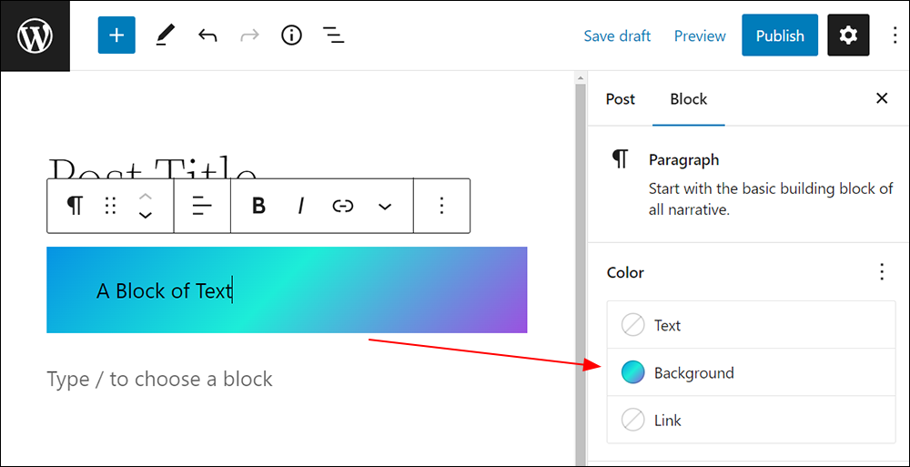
As you experiment with different colors, note that the icon for the Color settings option updates dynamically to reflect the chosen colors. This gives you an ‘at a glance’ view of the color scheme you are creating when you switch between the block Color settings.
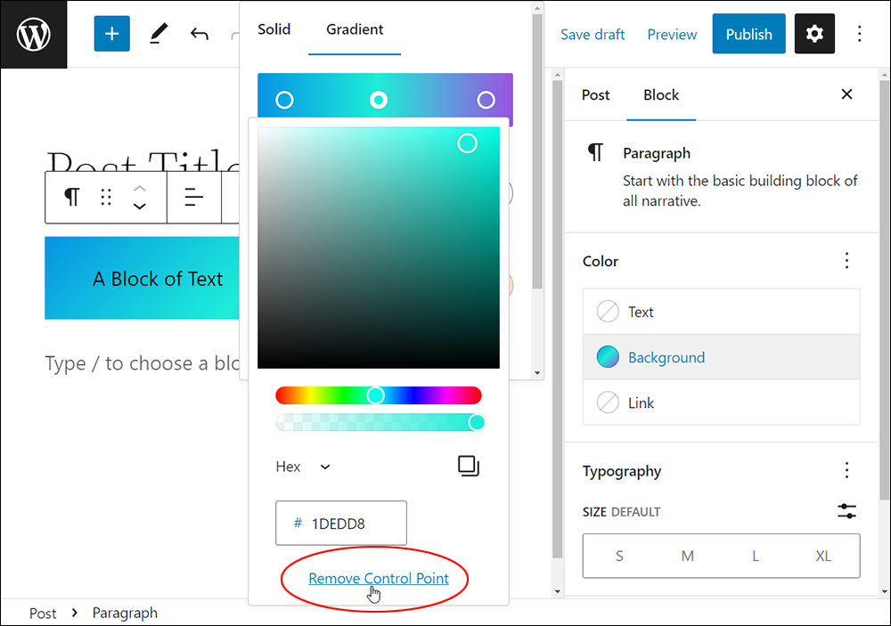
You can also remove any additional control points in your gradients by selecting the point in the Gradient tool and clicking on the Remove Control Point link.
Remember to save your work after making changes to update your block’s color settings.
Color Settings: Link
In addition to setting colors for a block’s text and background, you can set a color for links by selecting Link in the Color settings box.
To select the Link option:
- Select the block,
- Select the Block settings panel to view the Color settings option,
- Click on Link.
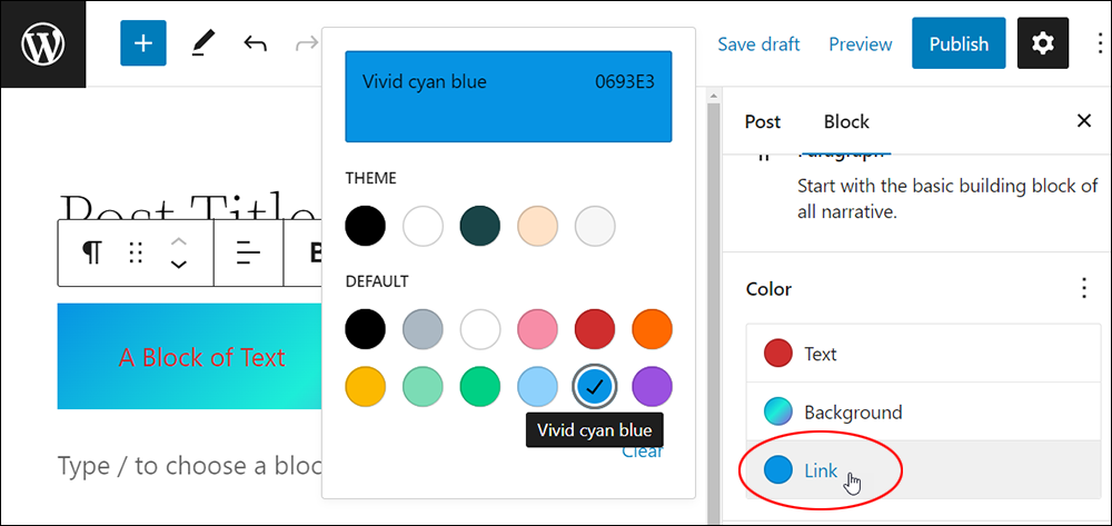
Select the link color from the Theme or Default color palettes.
When you link text inside the block it will inherit the color you’ve set.
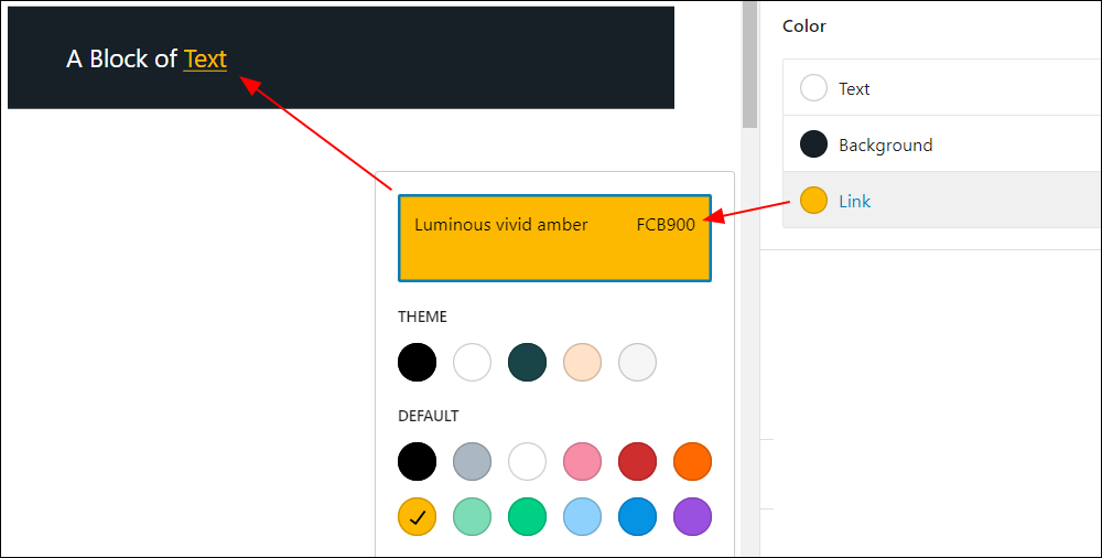
Remember to save your work after making changes to update your block’s color settings.
Resetting Color Options To Default Settings
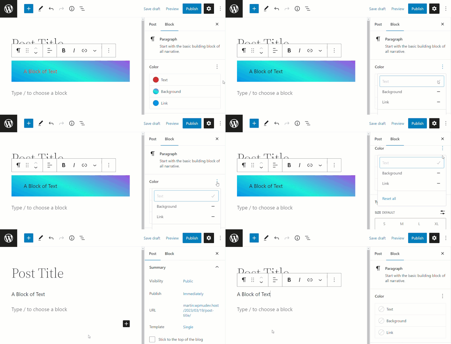
You can reset your color properties to their default state individually or all at once.
To reset Color options for a block, click on the ellipsis symbol on the right-hand side of the Color settings box.
If a color has been set for an element of the block (text, background, or link), you will see a “minus” symbol (i.e. a dash).
Click on the minus symbol to clear the settings for an individual option.
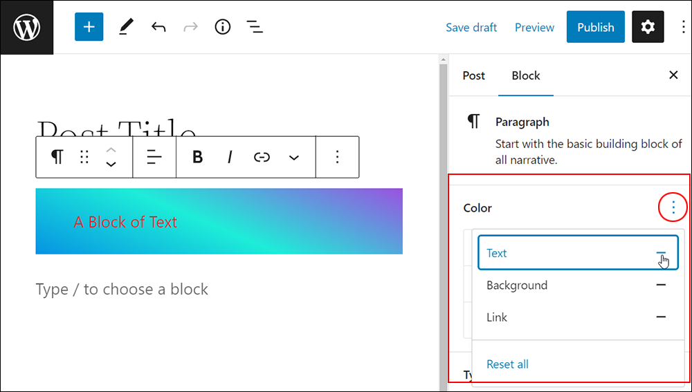
To reset all color settings for a block to their default state, repeat the above process and click on the ellipsis symbol on the right-hand side of the Color settings box to bring up the reset options.
This time, however, click on the Reset all button.
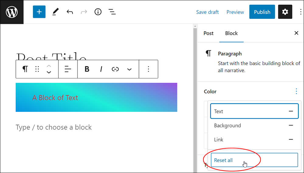
All color options for the block will be reset to their default state.
WordPress Block Editor Color Settings – FAQs
Here are frequently asked questions about WordPress Block Editor Color settings:
How can I change the text color of a block in the WordPress Block Editor?
To change the text color of a block, select the block you want to modify, then navigate to the block settings panel on the right-hand side. Look for the “Color” or “Text Color” option, where you can choose from preset colors or define a custom color using a color picker.
Are there options to change background colors for blocks in the Block Editor?
Yes, many blocks in the WordPress Block Editor offer settings to change the background color. Locate the block settings panel and look for the “Background Color” option, where you can select predefined colors or specify a custom background color.
Can I apply different colors to different parts of a block, such as headings or paragraphs?
Yes, the Block Editor allows users to apply different colors to various parts of a block. For instance, you can set different text colors for headings and paragraphs within a block by selecting each element individually and adjusting their color settings.
Do WordPress themes affect color options in the Block Editor?
Yes, WordPress themes can influence color options in the Block Editor. Some themes may provide additional color customization features or override default color settings to maintain consistency with the theme’s design.
Are there advanced color customization options available for developers?
Developers can utilize CSS customizations or theme.json files to implement advanced color customization options for blocks in the Block Editor. These methods allow for precise control over colors, including gradients and opacity.
How can I reset color settings for a block to default?
To reset color settings for a block to default, locate the color settings panel for the block and look for a “Reset” or “Default” button. Clicking this button will revert the color settings to their original state.
***
Congratulations! Now you know how to adjust your block’s color settings.
Additional Block Settings
Click on a tutorial from the list below to learn about using other common block settings in the WordPress block editor.
***
For more tutorials in this series, go here:
- The WordPress Block Editor (Gutenberg)
- How To Use WordPress Blocks
- How To Use The WordPress Block Editing Toolbar
- How To Use The WordPress Block Editor Content Area
- How To Use The WordPress Block Editor Settings Section
- WordPress Block Editor: Block Settings
***
Updated: July 5th, 2024
