WordPress Block Editor – Block Settings: Dimensions
 This tutorial is part of our series on using common block settings in the WordPress Block Editor Settings Section.
In this tutorial, you will learn how to customize a block’s dimensions settings and properties.
For a complete understanding of how to use the WordPress Block Editor, see the other tutorials in this series:
- WordPress Block Editor: Block Settings
- How To Use The WordPress Block Settings Section
- How To Use WordPress Blocks
***
Block Settings – Dimensions
Many block types allow you to customize and edit their dimension settings and options.
Note: Block types that support dimension properties must be selected in the content editor area to display the Dimensions settings in the Block Settings panel.
If you need help using block settings, see this tutorial: WordPress Block Editor: Block Settings
Dimensions Properties
You can edit and customize the following settings and options in blocks that support dimensions:
- Padding – You can specify the padding around an element using preset or custom dimensions. Custom dimensions can be set in different units like px, em, rem, etc. For example, you can set the padding around an element to preset level 1, 2, 3, etc. or 18px, 20%, etc.
- Minimum Height of Cover – You can set a minimum height to guarantee an element will always display at least as high as you set it, regardless of the size screen someone uses to view the page.
Here’s what the units mentioned above mean:
- px – stands for “pixels” and is a fixed-size unit of measurement that is based on the screen resolution of the device being used. For example, the font size of the text can be set to 16 pixels.
- em – stands for “em space” and is a relative unit of measurement that is based on the font size of the parent element. For example, font size = 1.5em sets the font size of the text to 1.5 times the font size of the parent element.
- rem – stands for “root em” and is a relative unit of measurement that is based on the font size of the root element (usually the html tag). For example, font size = 1.5rem sets the font size of the text to 1.5 times the font size of the root element.
- vw – stands for “viewport width.”. This unit of measurement is used to size elements in relation to the width of the viewport. For example, if a designer wanted to create a full-width image that spanned the entire width of the viewport, they could use
width: 100vw;in their CSS code. This would ensure that the image always fills the entire width of the viewport, regardless of the device’s size or browser window. - vh – stands for “viewport height.” This unit of measurement is used to size elements in relation to the height of the viewport. For example, if a designer wanted to create a hero section with a height that takes up the entire viewport, they could use
height: 100vh;in their CSS code. This would ensure that the hero section always fills the entire height of the viewport, regardless of the device’s size or browser window. - % – Percentage. This unit of measurement is used to size elements in relation to the size of their parent container. For example, if a designer wanted to create a responsive layout where the width of an element is always 50% of the width of its parent container, they could use
width: 50%;in their CSS code. This would ensure that the element always takes up 50% of the width of its parent container, regardless of the device’s size or browser window.
Notes:
- The above properties are also referred to as CSS Units.
- CSS stands for Cascading Style Sheets, which is a language used to describe the visual presentation of a web page. In simpler terms, CSS helps to make a web page look good. It is used to control the layout, colors, fonts, and other visual elements of a web page, separating the presentation from the structure of the HTML code.
- CSS units are used to specify measurements for the elements in a web page. Think of it like a ruler, but for your computer screen.
- There are different types of CSS units, including absolute units like pixels (px), which are a fixed size regardless of the device being used to view the web page, and relative units like percentages (%), which adjust their size relative to the size of their parent element.
- Using CSS and CSS units allows web developers to create web pages that look consistent across different devices and screen sizes, making the user experience better.
Additionally, it’s helpful to understand the difference between Margin and Padding.
Margin vs Padding
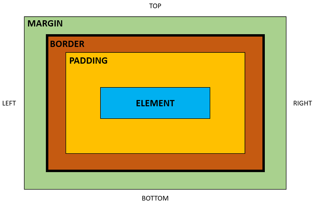
Borders, margins, and padding are all used to control the spacing and layout of elements on a webpage, but they each have a specific purpose and behave differently.
- Borders: Borders are used to create a visible boundary around an element on a webpage. A border can be applied to any HTML element, including images, tables, and text. Borders are defined by their width, style, and color.
- Margins: Margins are the space between an element and its surrounding elements. They are used to control the layout and spacing of elements on a webpage. Margins can be applied to any HTML element, including images, tables, and text. Margins are defined by their size, which can be specified in pixels, ems, or percentages.
- Padding: Padding is the space between the content of an element and its border. It is used to control the amount of space between the content of an element and its border. Padding can be applied to any HTML element, including images, tables, and text. Padding is defined by its size, which can be specified in pixels, ems, or percentages.
In summary, borders define a visible boundary around an element, margins control the space between an element and its surrounding elements, and padding controls the space between the content of an element and its border.
In even simpler terms:
- Padding surrounds an element inside its border.
- Margin surrounds an element outside its border
Global Dimension Settings
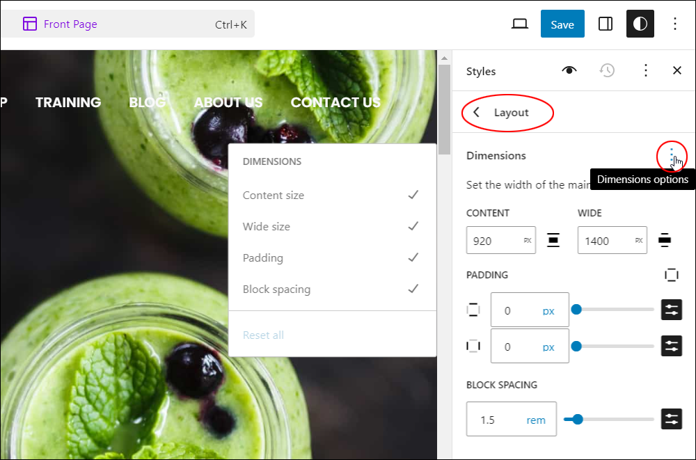
You can also apply global settings to style your site’s Layout settings and affect dimensions sitewide, such as:
- Content size: Determines the width of the content area on your webpage. Adjusting this option changes how much space your content occupies within the layout.
- Wide size: Sets the width of wider content elements, such as images or embedded media. It allows for variation in layout by defining how much space these elements can take up.
- Padding: Adds space between the content and its surrounding elements, such as borders or adjacent blocks. Adjusting padding affects the visual spacing within your layout, and provides breathing room for your content.
- Block spacing: Determines the distance between individual blocks or sections of content on your webpage. It helps organize the layout and improves readability by creating visual separation between different parts of your content.
To learn more about changing global dimension settings on your site, see this tutorial: WordPress Block Settings: Styles
Dimensions Settings
In this section, we’ll look at how to customize and edit the default settings in blocks that support dimensions.
Note: A block’s dimensions settings may include additional options depending on which blocks you select and what plugins and themes are installed on your site.
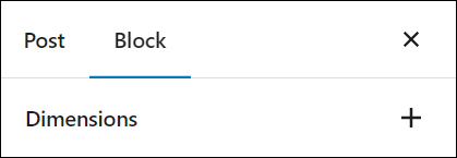
When you click on a block that supports dimensions, you may only see the default setting “Dimensions” displayed in the Block Settings panel.
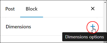
Click on the “+” sign to view all the available Dimensions options for the block.
Click on the option…
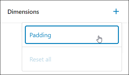
Enabling an option displays a “tick” symbol.
Click on an area outside the pop-up panel to hide the panel and display the option(s) you have just enabled.
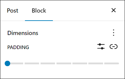
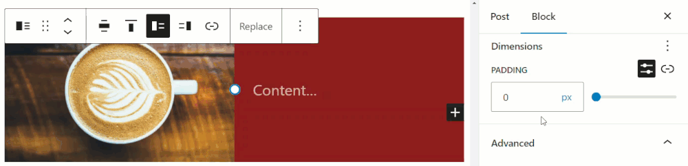
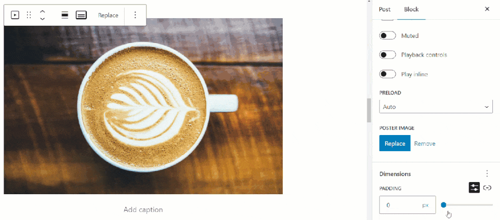
Dimensions Settings: Padding
Padding is the default option for blocks that support dimensions settings.
You can change the padding set for a block using either a preset value or a custom value.
Change Padding Using A Preset Value
To edit a block’s padding using a preset value:
- Select the block.
- Select the Block settings panel to view the Dimensions settings option.
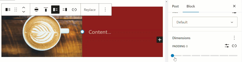
- Move the slider to the right to increase the padding. There are 7 preset values available:
- 0.44 rem
- 0.67 rem
- 1 rem
- 1.5 rem
- 2.25 rem
- 3.38 rem
- 5.06 rem
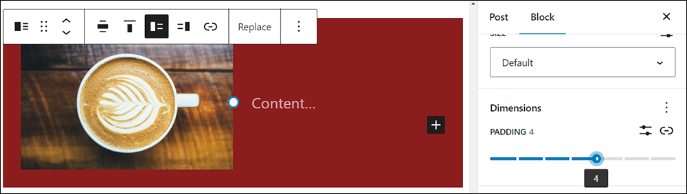
As you click on each of the preset values options in the Padding selector, the content editor’s live preview shows the block’s padding automatically increasing or decreasing on your screen.
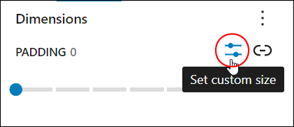
Set Custom Padding Value
To set a custom padding value for a block:
- Select the block.
- Select the Block settings panel to view the Padding settings option.
- Click on the Set custom size icon to bring up the Custom Size field.
- Enter a value in the custom field or use the slider.
Let’s go through this step-by-step.
Click on the Set custom size icon…
This displays the Padding custom value field and slider…
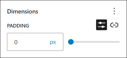
Enter your custom value or adjust the slider to set your padding.
You can also specify different units of measurement for setting padding values from the unit drop-down menu.
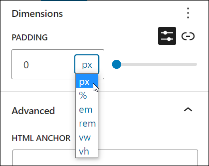
Changing the units of measurement affects how padding works, so experiment to find what works best for you and preview your changes on the live editor screen.
Remember to save your work after making changes to update your block’s settings.
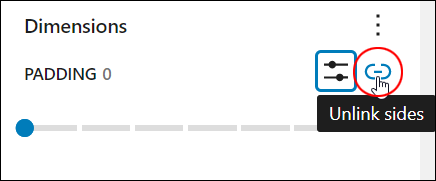
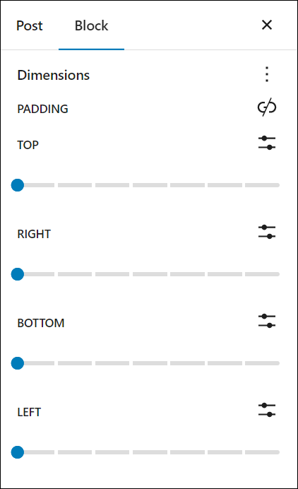
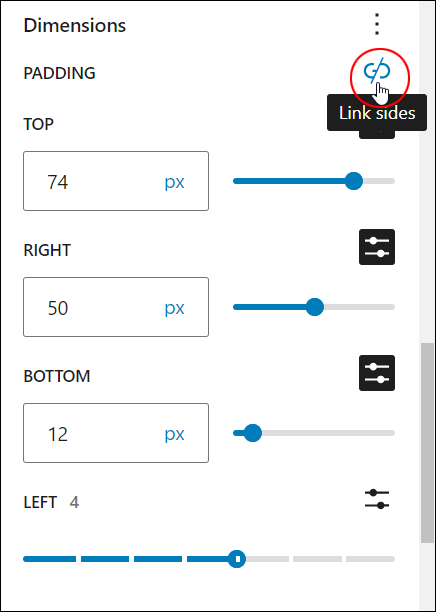
Unlinking Sides
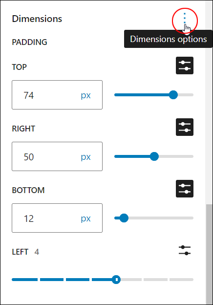
You can set different padding values for a block element by unlinking its sides.
Click on the Unlink sides icon to access this feature…
The screen will now display separate padding options for the top, right, bottom, and left sides of the block’s element.
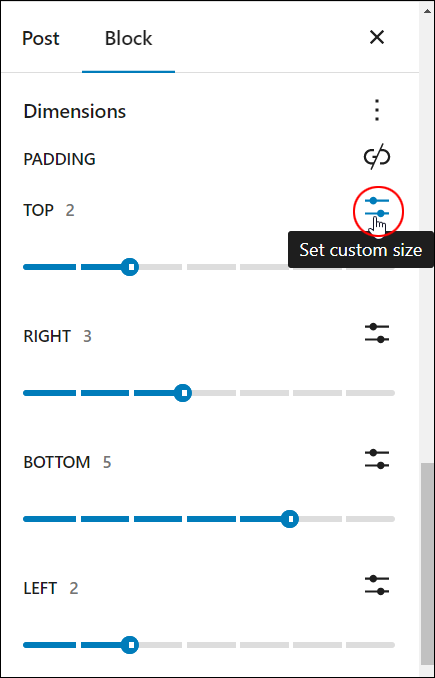
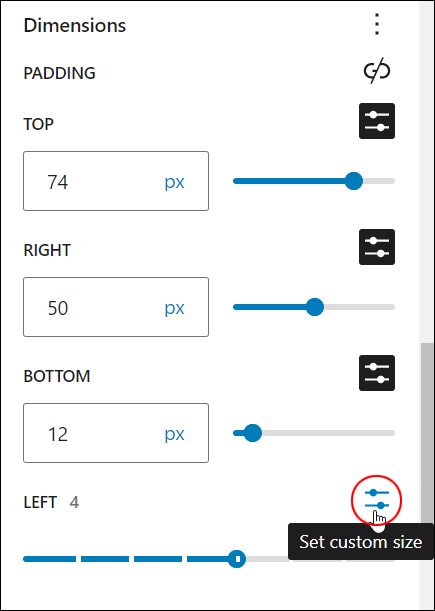
Enter different padding options for each side using the presets, or click on the Set custom size icon to switch to the custom fields and enter a custom padding value.
You can use a combination of presets and entering custom values to set the padding for the block element’s sides.
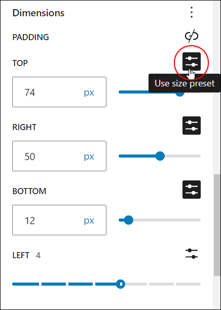
To switch from a preset value to a custom value, click on the Set custom size icon.
To switch from a custom value to a preset value, click on the Use size preset icon.
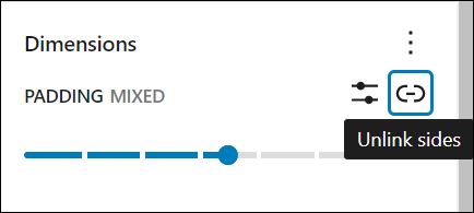
To link all sides back when working on separate sides, click on the Link sides icon.
Note that if you link sides again after setting separate padding values for each side, the Padding value field will display “Mixed” values.
Experiment with different padding options to set the dimensions right for your block’s element.
Remember to save your work after making changes to update your block’s settings.
Additional Dimensions Options
As mentioned earlier, different block types can add new options to the Dimensions settings panel.
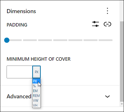
For example, the Cover block adds a Minimum Height Of Cover option.
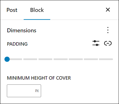
This lets you set the minimum height to display a cover image on the block.
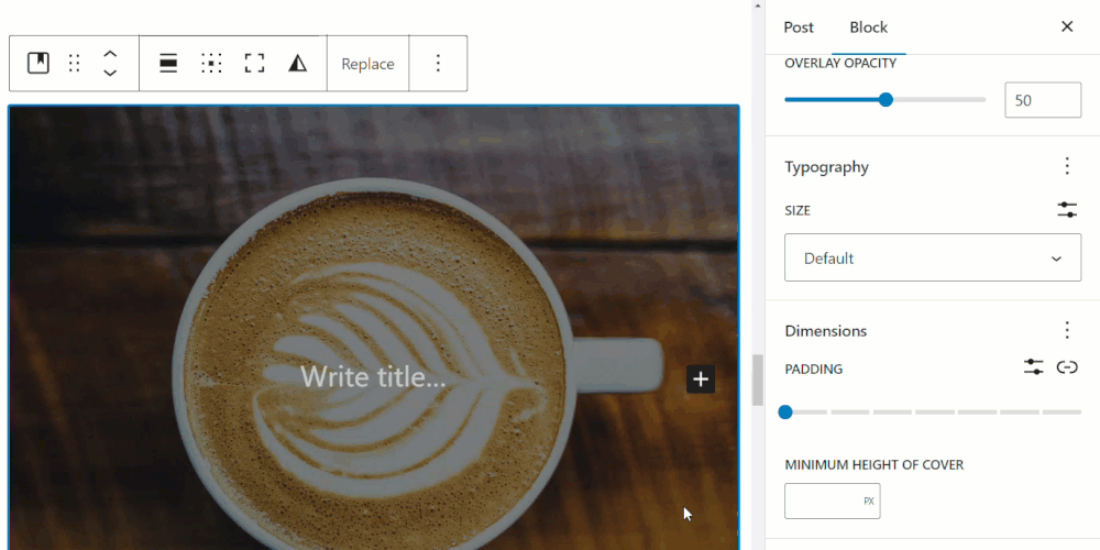
You can choose different units to enter the minimum height of cover value by selecting the unit from a dropdown menu.
Remember to save your work after making changes to update your block’s settings.
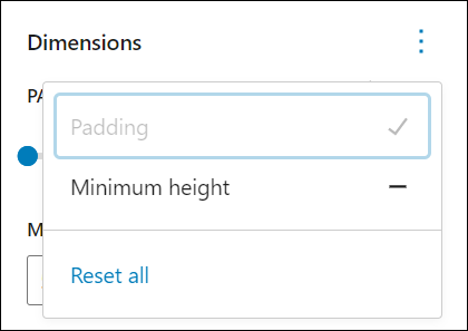
Resetting Dimensions Options To Default Settings
You can reset your dimensions properties to their default state individually or all at once.
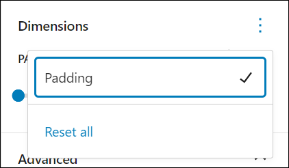
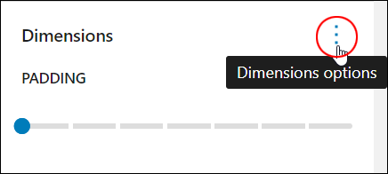
To reset your block settings, click on the ellipsis symbol on the right-hand side of the Dimensions settings box.
You can access the Dimensions options section whether you are working on a block’s element with all sides linked…
Or all sides unlinked…
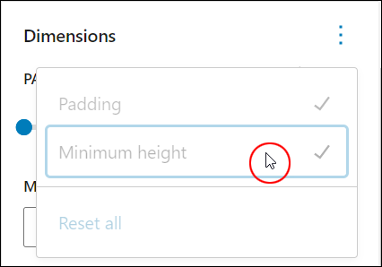
If you have enabled any options, you will see a “dash” symbol next to the option title. Click on the option to remove the dash and restore the default settings for that option and it will turn into a ‘tick’.
Once all options have been turned into “ticks,” your settings are restored to their default values.
To reset all settings to their default state at once, click on Reset all.
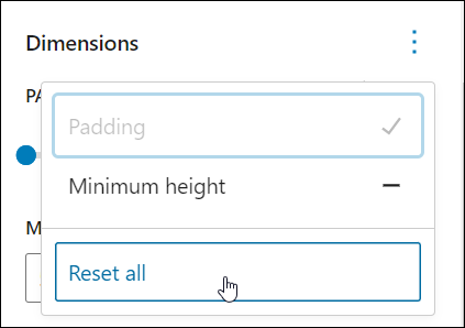
All dimensions options for the block will be reset to their default state.
WordPress Block Editor Dimensions Settings – FAQs
Here are frequently asked questions about WordPress Block Editor Dimensions settings:
Why don’t I see the ‘Dimensions’ settings in the Block Editor?
If you’re not seeing the ‘Dimensions’ settings in the Block Editor, it could be due to several reasons. Firstly, not all blocks offer dimension settings. Secondly, some themes or plugins may customize the Block Editor interface, potentially hiding or modifying certain settings.
How can I adjust the size of a block in the Block Editor?
To adjust the size of a block in the Block Editor, select the block you want to modify, then navigate to the block settings panel on the right-hand side. Look for options such as width, height, padding, or margins, where you can adjust the dimensions of the block.
Can I set custom dimensions for individual blocks?
Yes, you can set custom dimensions for individual blocks in the Block Editor. Depending on the block type, you may find options to specify width, height, padding, or margins to tailor the block’s appearance to your liking.
Are there predefined dimensions available for certain blocks?
Some blocks in the Block Editor offer predefined dimensions to streamline the design process. For example, image blocks may have preset size options like small, medium, or large, allowing you to quickly adjust the image’s dimensions.
Do WordPress themes influence dimension settings in the Block Editor?
Yes, WordPress themes can impact dimension settings in the Block Editor. Themes may provide default styles or override block settings to maintain consistency with the theme’s design. Custom themes may offer more extensive dimension customization options.
How can I reset dimension settings for a block to default?
To reset dimension settings for a block to default, locate the dimension settings panel for the block and look for a “Reset” or “Default” button. Clicking this button will revert the dimension settings to their original state.
***
Congratulations! Now you know how to adjust your block’s dimensions settings.
Additional Block Settings
Click on a tutorial from the list below to learn about using other common block settings in the WordPress block editor.
***
For more tutorials in this series, go here:
- The WordPress Block Editor (Gutenberg)
- How To Use WordPress Blocks
- How To Use The WordPress Block Editing Toolbar
- How To Use The WordPress Block Editor Content Area
- How To Use The WordPress Block Editor Settings Section
- WordPress Block Editor: Block Settings
***

Updated: July 5th, 2024