WordPress Block Editor – Block Settings: Border
 This tutorial is part of our series on using common block settings in the WordPress Block Editor Settings Section.
In this tutorial, you will learn how to customize a block’s border settings and properties.
For a complete understanding of how to use the WordPress Block Editor, see the other tutorials in this series:
- WordPress Block Editor: Block Settings
- How To Use The WordPress Block Settings Section
- How To Use WordPress Blocks
***
Block Settings – Border
Many types of blocks allow you to customize and edit their border settings and options.
Note: Block types that support border properties must be selected in the content editor area to display the border settings in the Block Settings panel.
If you need help using block settings, see this tutorial: WordPress Block Editor: Block Settings
Border Properties
You can edit and customize the following settings and options in blocks that support borders:
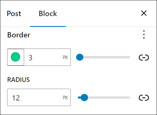
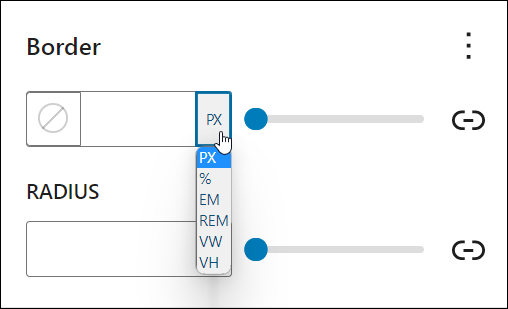
- Border – You can specify the size of the border. The value can be set in different units (px, em, rem, %, vw, and vh). For example, you can set the border size to 3, 8, 12, etc. pixels (3px, 8px, 12px, etc.).
- Radius– You can set a radius value to create round borders. The value can be set in different units (px, em, rem, %, vw, and vh). For example, you can set the border radius to 20%, 50%, etc.
Here’s what some of the border-related options mentioned above mean:
- px – stands for “pixels” and is a fixed-size unit of measurement that is based on the screen resolution of the device being used. For example, the font size of the text can be set to 16 pixels.
- em – stands for “em space” and is a relative unit of measurement that is based on the font size of the parent element. For example, font size = 1.5em sets the font size of the text to 1.5 times the font size of the parent element.
- rem – stands for “root em” and is a relative unit of measurement that is based on the font size of the root element (usually the html tag). For example, font size = 1.5rem sets the font size of the text to 1.5 times the font size of the root element.
- vw – stands for “viewport width.”. This unit of measurement is used to size elements in relation to the width of the viewport. For example, if a designer wanted to create a full-width image that spanned the entire width of the viewport, they could use
width: 100vw;in their CSS code. This would ensure that the image always fills the entire width of the viewport, regardless of the device’s size or browser window. - vh – stands for “viewport height.” This unit of measurement is used to size elements in relation to the height of the viewport. For example, if a designer wanted to create a hero section with a height that takes up the entire viewport, they could use
height: 100vh;in their CSS code. This would ensure that the hero section always fills the entire height of the viewport, regardless of the device’s size or browser window. - % – Percentage. This unit of measurement is used to size elements in relation to the size of their parent container. For example, if a designer wanted to create a responsive layout where the width of an element is always 50% of the width of its parent container, they could use
width: 50%;in their CSS code. This would ensure that the element always takes up 50% of the width of its parent container, regardless of the device’s size or browser window.
Notes:
- The above properties are also referred to as CSS Units.
- CSS stands for Cascading Style Sheets, which is a language used to describe the visual presentation of a web page. In simpler terms, CSS helps to make a web page look good. It is used to control the layout, colors, fonts, and other visual elements of a web page, separating the presentation from the structure of the HTML code.
- CSS units are used to specify measurements for the elements in a web page. Think of it like a ruler, but for your computer screen.
- There are different types of CSS units, including absolute units like pixels (px), which are a fixed size regardless of the device being used to view the web page, and relative units like percentages (%), which adjust their size relative to the size of their parent element.
- Using CSS and CSS units allows web developers to create web pages that look consistent across different devices and screen sizes, making the user experience better.
Border Settings
In this section, we’ll look at how to customize and edit the default settings in blocks that support borders.
Note: A block’s border settings may include additional options depending on which blocks you select and what plugins and themes are installed on your site.
To view all the available border options, click on the ellipsis icon (3 vertical dots) in the top right-hand section of the panel.
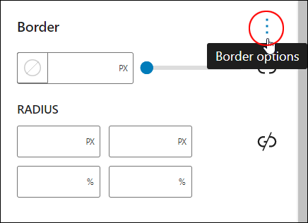
This will bring up a list of all the available options you can select to edit the typography settings for the block.
Border Settings: Border
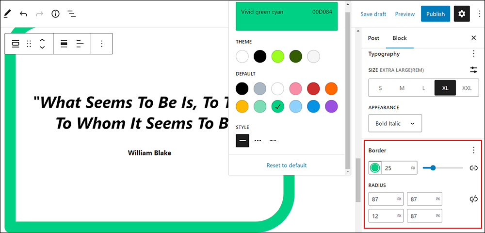
The Border setting lets you specify the color, size, and radius of a border.
Specify Border Color
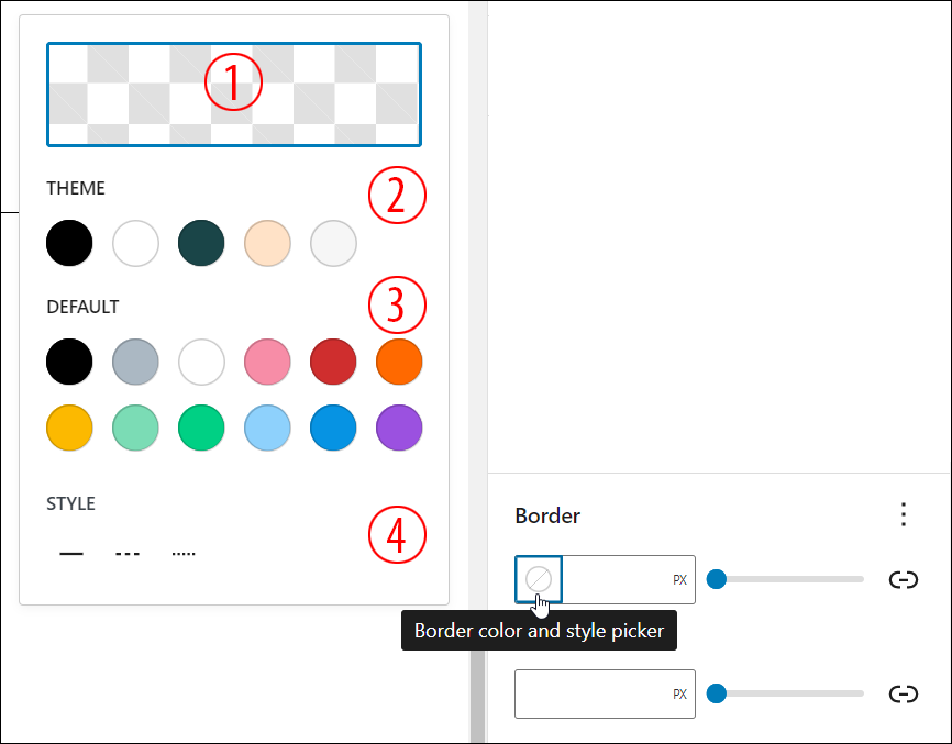
To specify the color of the border:
1. Select the block.
2. Select the Block settings panel to view the Border settings option.
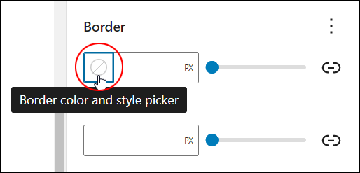
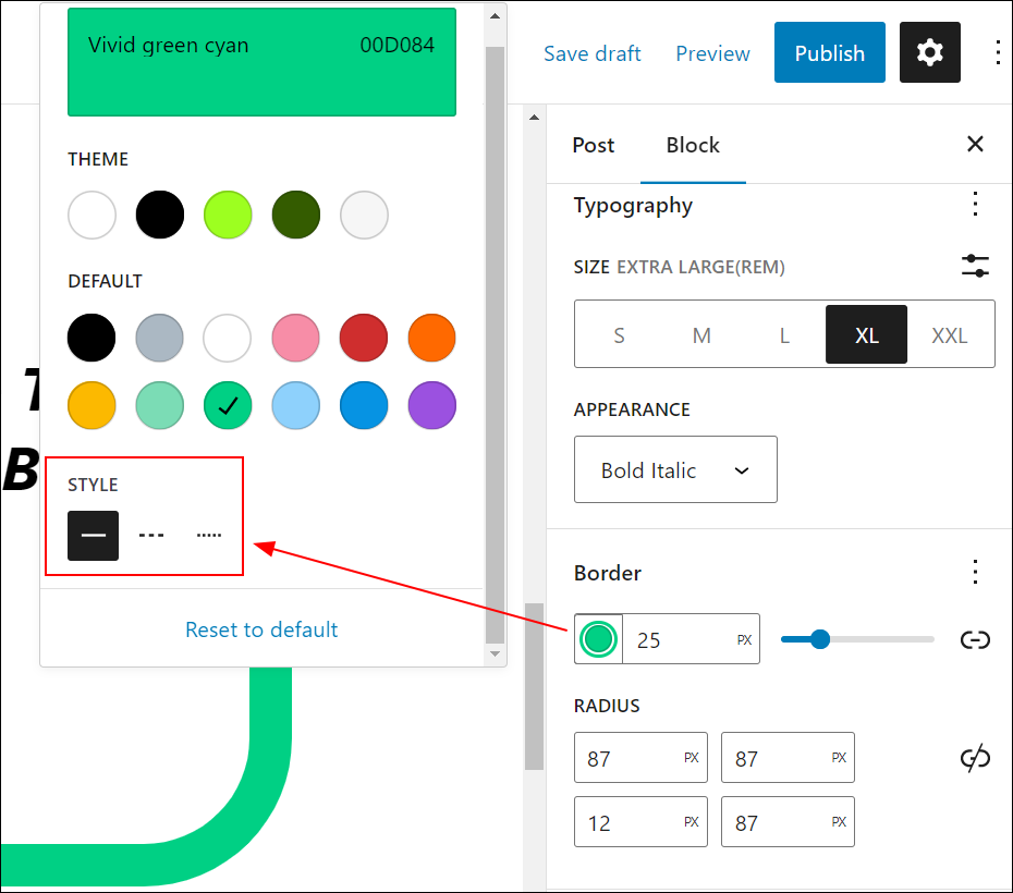
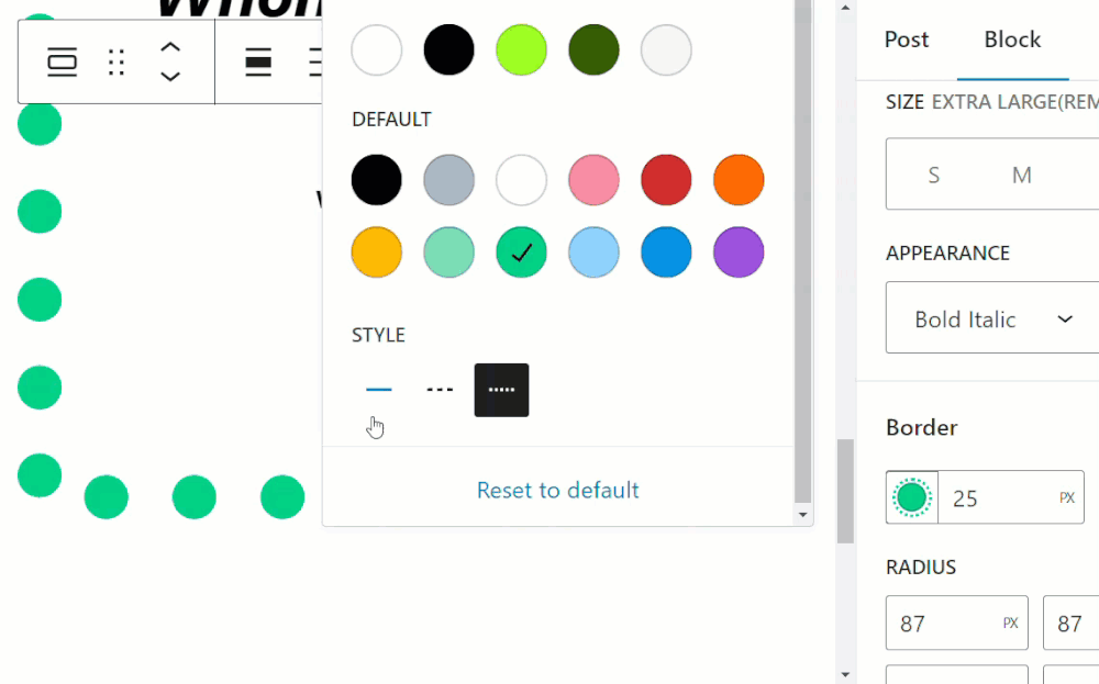
3. Click on the border color and style picker icon (the circle with a diagonal line through it)
4. A pop-up panel containing the following options will display:
-
- Color Picker – allows you to specify the color of your choice using the built-in color picker.
- Theme Color Palette – displays colors from the color palette associated with your active theme. Note that many newer block themes let you easily change their entire color palette, which affects the color options displayed in the Theme section of the popup panel.
- Default – displays default colors set by the WordPress software installation on your site.
- Style – displays different border styles (e.g. solid line, dashed, dotted)
5. Select a color for your border. The border color and style picker icon will display your selected border color.
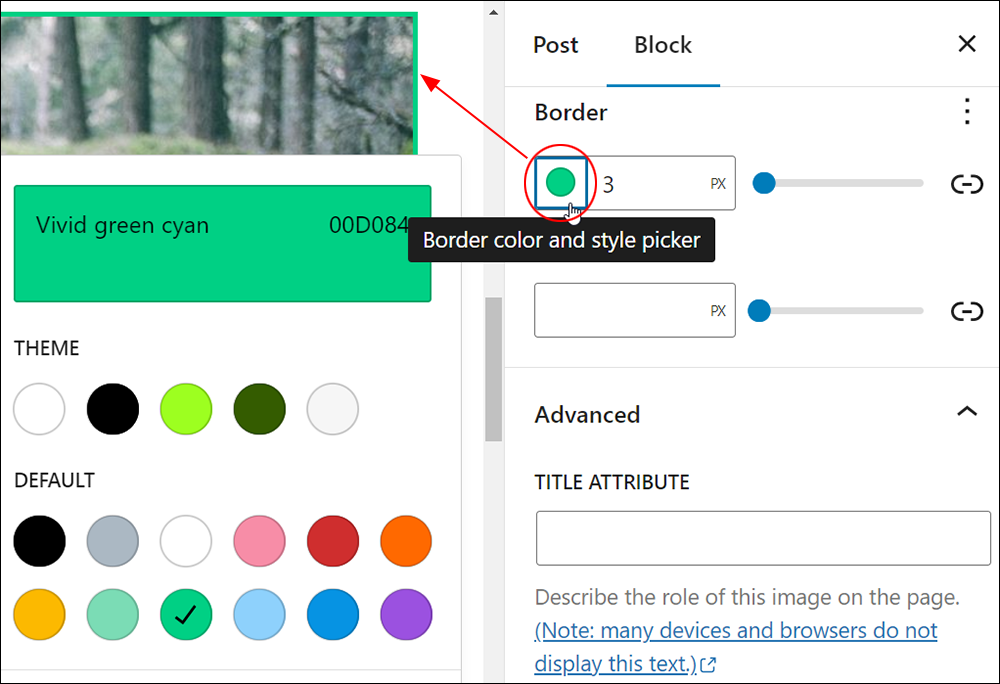
If you select the Color Picker option, a dynamic color selector will pop up allowing you to select an exact color by using sliders and different color selection units (Hex, RGB, HSL).
To learn more about using the color picker, see the Block Settings: Color tutorial.
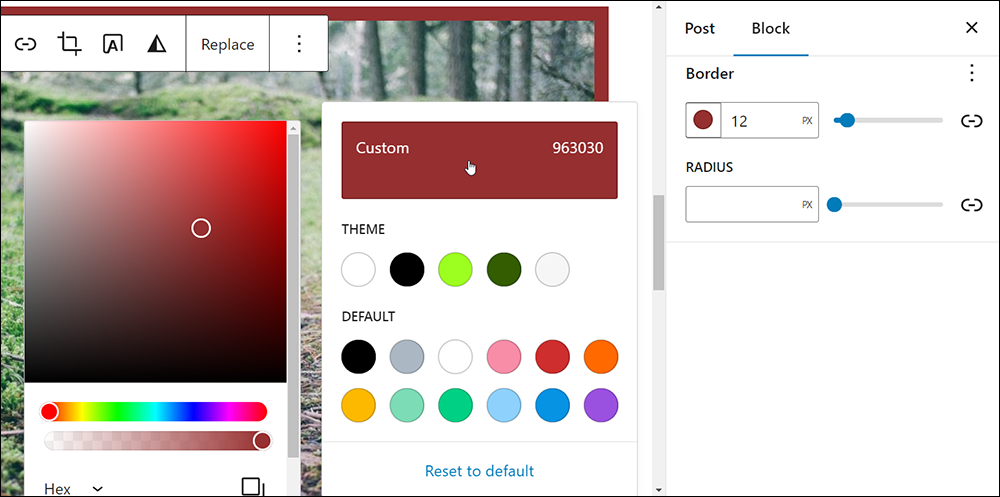
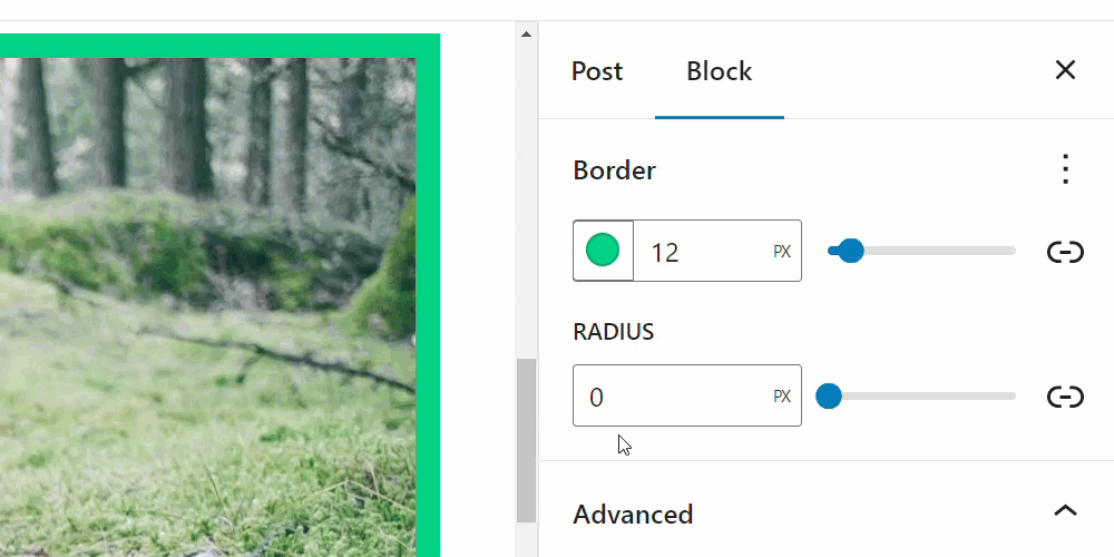
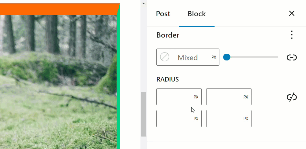
Specify Border Size
To specify the size of the border, enter a value into the size field next to the color border and style picker selector or use the adjusting slide. You can preview the border size changes live on the content editor as you enter and experiment with different values.
You can use different measurement units to set border size values (refer to the introduction section for these unit definitions).
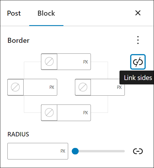
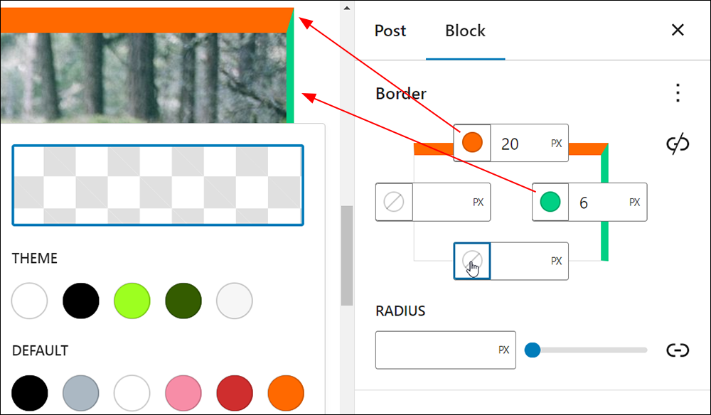
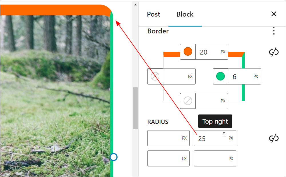
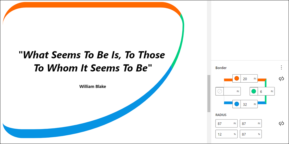
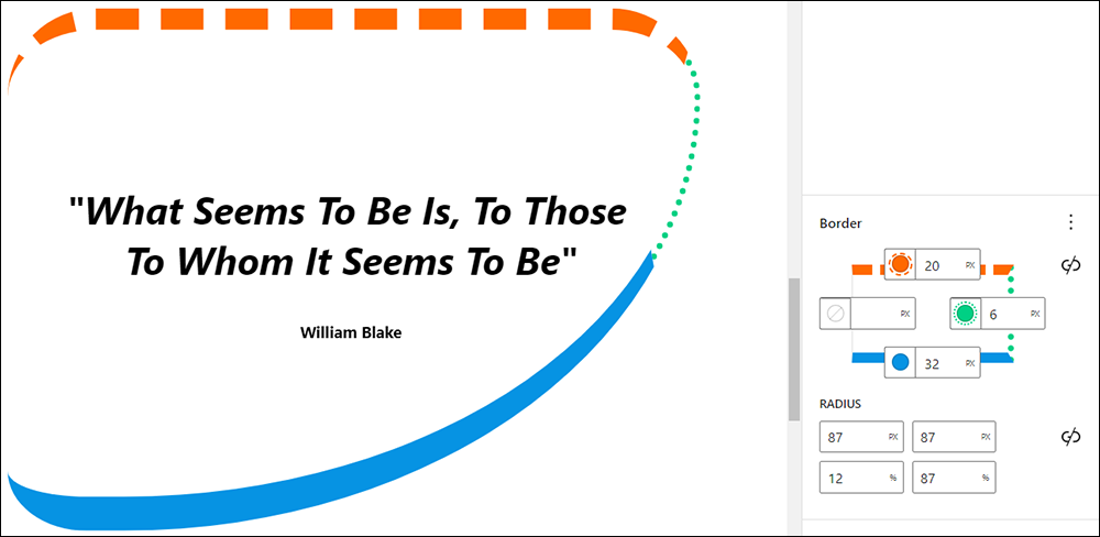
You can also specify different border colors and widths by clicking on the Unlink sides icon.
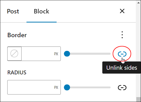
This will display different fields for each of the block sides.
Note: When clicked, the ‘Unlink sides” button will turn to “Link sides.” Click on the button to link the border sides again.
Click on each of the side fields to set different border colors and sizes.
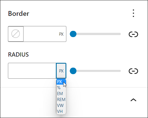
Specify Border Radius
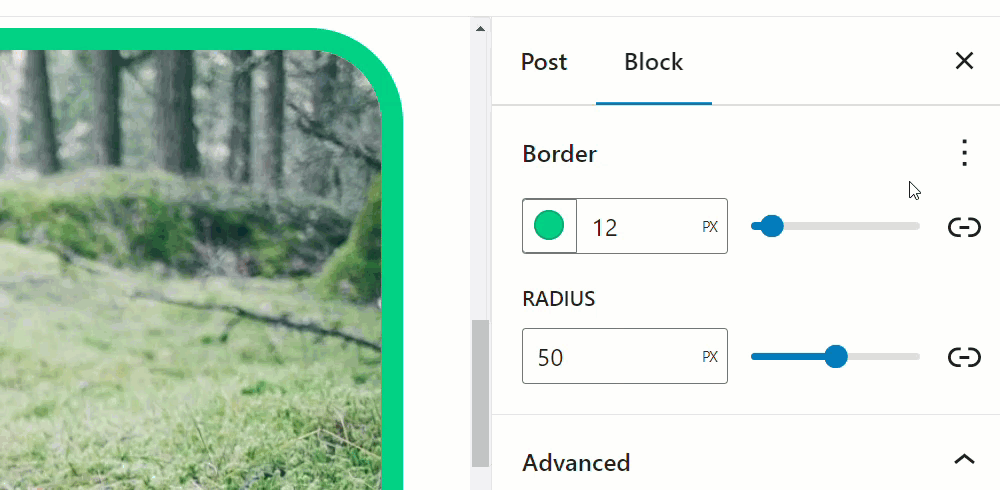
To specify a radius size for the border, enter a value into the Radius field or use the adjusting slide.
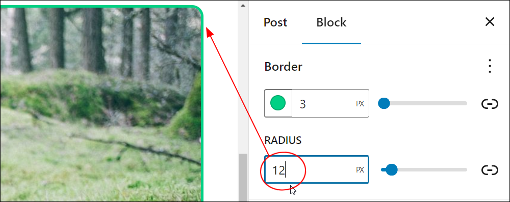
You can preview the changes to your border’s radius live on the editor as you enter different values.
You can also specify different border radii by clicking on the Unlink radii icon.
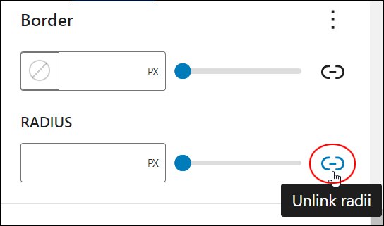
This will display different fields for each of the block sides.
Enter different radii values for each border side or leave these blank to keep their default setting.
You can use different measurement units to set border radii values (refer to the introduction section for these unit definitions).
By experimenting with different values and units of measurement, you can create interestingly-shaped borders for your blocks.
You can mix different measurement units for your separate Border and Radius values to create unusual shapes…
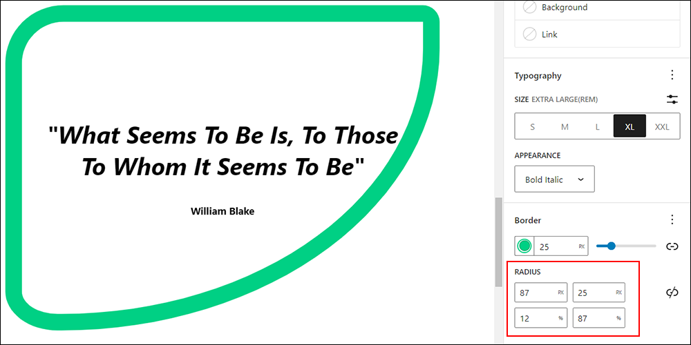
And use different colors to create eye-catching and attractive borders…
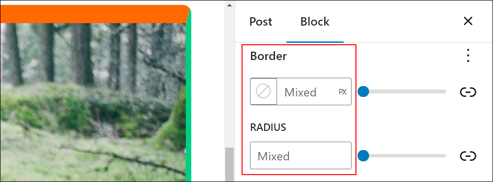
Note: if you unlink the fields and set different values then link these again (by clicking on the Link sides or Link radii icons), you will see that the fields will display a “Mixed” value.
Specify Border Styles
To specify a style for your borders, click on the Border color and style picker icon and choose one of the available styles from the Style section.
If you are setting a unified border color and size, your selected style will apply to the entire border.
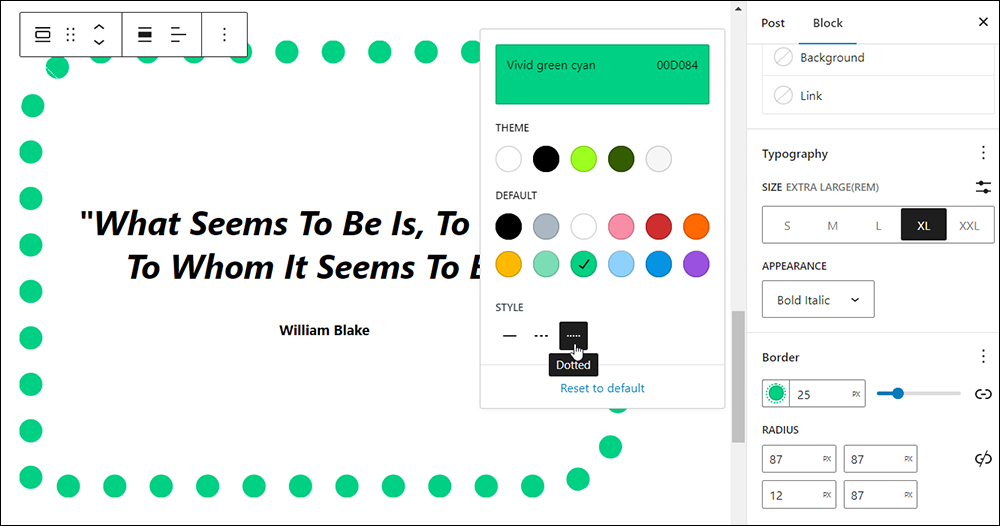
You can preview the changes to border styles live on the editor as you choose different style options.
You can also select different styles for different sides of your border…
Remember to save your work after making changes to update your block’s settings.
Resetting Border Options To Default Settings
You can reset your border properties to their default state individually or all at once.
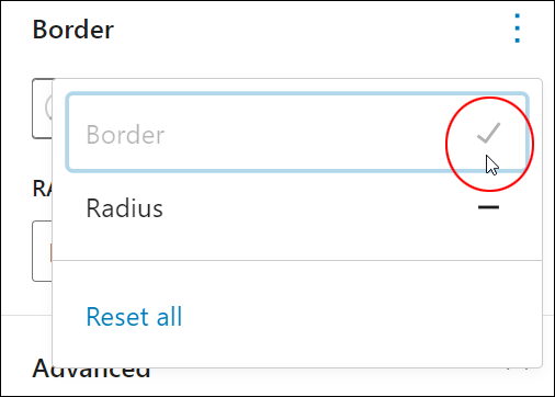
To reset your block settings, click on the ellipsis symbol on the right-hand side of the Border settings box.
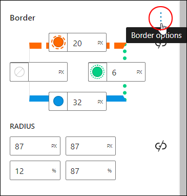
If you have made changes, you will see a “dash” symbol next to the option title. Click on the dash to restore your border or radius option to its default settings and the dash will turn into a ‘tick’.
If you see the ‘tick’ symbol next to an option, it means that the option has been restored to its default settings. Clicking on an option with the tick symbol won’t do anything.
To reset all settings to their default state, click on Reset all.
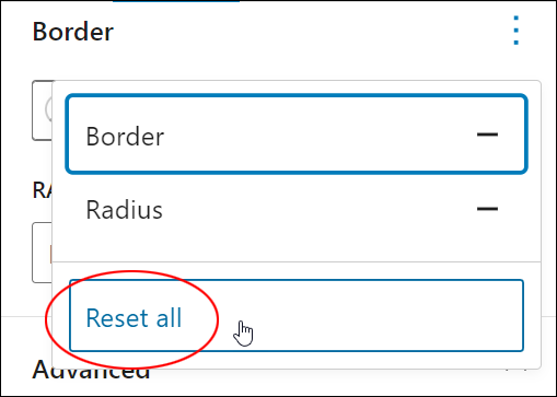
All border options for the selected block will be reset to their default state.
WordPress Block Editor Border Settings – FAQs
Here are frequently asked questions about WordPress Block Editor Border settings:
How do I add borders to blocks in the WordPress Block Editor?
To add borders to blocks, select the desired block within the Block Editor. Then, navigate to the block’s settings panel on the right-hand side of the editor interface. Look for the “Border” or “Border Settings” option, where users can customize the border style, color, width, and radius.
Why can’t I see border settings for certain blocks in the Block Editor?
Some blocks in the WordPress Block Editor may not have border settings available by default. Check if the block you’re using supports border customization. If not, consider using a different block or exploring custom CSS solutions for achieving the desired border effect.
Can I customize the border style for individual sides of a block?
Yes, WordPress Block Editor Border Settings typically allow users to customize the border style for each side of a block independently. Users can specify different styles, colors, and widths for the top, bottom, left, and right borders of a block.
Are there predefined border styles available in the WordPress Block Editor?
Yes, the Block Editor often provides predefined border styles such as solid, dashed, and dotted. Users can choose from these preset styles or define custom border styles using CSS.
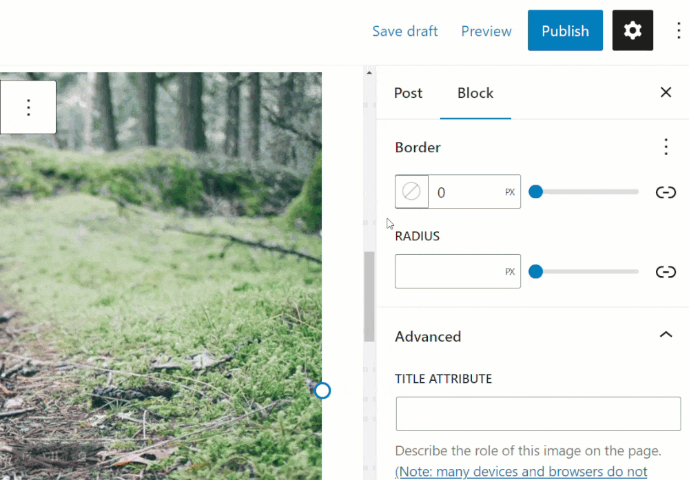
How can I remove borders from blocks in the Block Editor?
To remove borders from blocks, navigate to the border settings for the respective block and set the border width to zero (0) or select the “None” option for the border style.
Do themes or plugins offer additional border customization options for the Block Editor?
Yes, some WordPress themes and plugins may offer extended border customization options for the Block Editor, providing users with more control over border styles, effects, and advanced settings.
***
Congratulations! Now you know how to adjust your block’s border settings.
Additional Block Settings
Click on a tutorial from the list below to learn about using other common block settings in the WordPress block editor.
***
For more tutorials in this series, go here:
- The WordPress Block Editor (Gutenberg)
- How To Use WordPress Blocks
- How To Use The WordPress Block Editing Toolbar
- How To Use The WordPress Block Editor Content Area
- How To Use The WordPress Block Editor Settings Section
- WordPress Block Editor: Block Settings
***

Updated: July 5th, 2024