WordPress Block Editor – Block Settings: Typography
 This tutorial is part of our series on using common block settings in the WordPress Block Editor Settings Section.
In this tutorial, you will learn how to customize a block’s typography settings and properties.
For a complete understanding of how to use the WordPress Block Editor, see the other tutorials in this series:
- WordPress Block Editor: Block Settings
- How To Use The WordPress Block Settings Section
- How To Use WordPress Blocks
***
Block Settings – Typography
Many types of blocks allow you to customize and edit their typography settings.
Note: Block types that support typography properties must be selected in the content editor area to display the Typography settings in the Block Settings panel.
If you need help using block settings, see this tutorial: WordPress Block Editor: Block Settings
Typography Properties
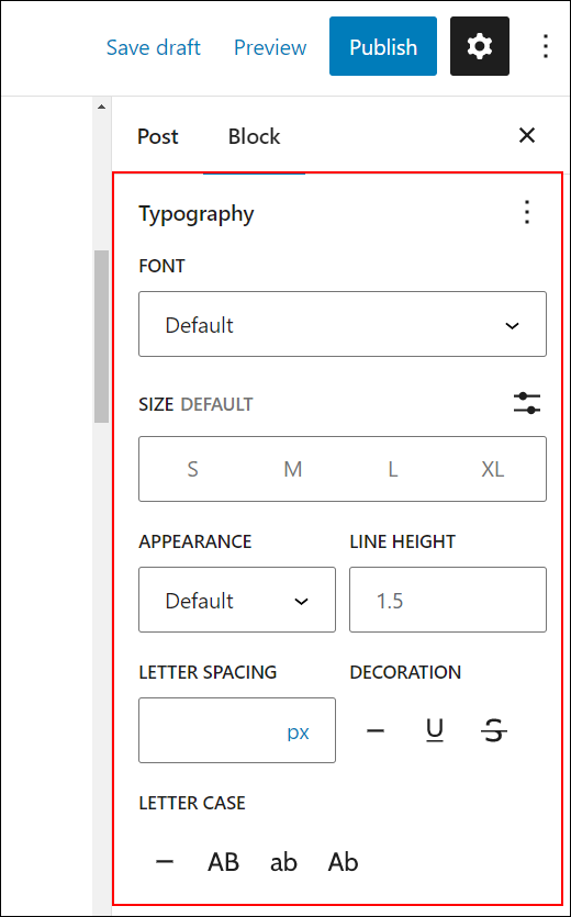
You can edit and customize the following settings and options in blocks that support typography:
- Font Size – You can specify the size of the font used in your text. The value can be set in different units like px, em, rem, etc. For example, you can set the font size to 18, 24, 36, etc. pixels (18px, 24px, 36px, etc.).
- Font Family – You can use a specific font for your text. For example “Arial” (a sans-serif font) or “Times” (a serif font). You can also install custom fonts using the WordPress Font Library.
- Appearance – You can modify the default appearance of the font. For example, your text font can be Regular, Bold, Extra Bold, Thin Italic, etc.
- Line Height – This property sets the vertical space between lines of text in an element (the spacing above/below the text). The value can be set in different units like em, px, %, etc. For example, you can set the line height to 1.5 times the font size of the text.
- Letter Spacing – This property sets the amount of space between characters in an element. The value can be set in different units like em, px, %, etc. For example, you can set the letter spacing to 1 pixel.
- Decoration – This property sets the decoration of the text in an element. For example, underline, strikethrough, etc.
- Letter Case – This property sets the capitalization of your text. For example, uppercase, lowercase, capitalize, etc.
- Drop cap – This property allows you to add a drop cap to the first letter of a content block.
Here’s what some of the typography-related properties mentioned above mean:
- px – stands for “pixels” and is a fixed-size unit of measurement that is based on the screen resolution of the device being used. For example, the font size of the text can be set to 16 pixels.
- em – stands for “em space” and is a relative unit of measurement that is based on the font size of the parent element. For example, font size = 1.5em sets the font size of the text to 1.5 times the font size of the parent element.
- rem – stands for “root em” and is a relative unit of measurement that is based on the font size of the root element (usually the html tag). For example, font size = 1.5rem sets the font size of the text to 1.5 times the font size of the root element.
- vw – stands for “viewport width.”. This unit of measurement is used to size elements in relation to the width of the viewport. For example, if a designer wanted to create a full-width image that spanned the entire width of the viewport, they could use
width: 100vw;in their CSS code. This would ensure that the image always fills the entire width of the viewport, regardless of the device’s size or browser window. - vh – stands for “viewport height.” This unit of measurement is used to size elements in relation to the height of the viewport. For example, if a designer wanted to create a hero section with a height that takes up the entire viewport, they could use
height: 100vh;in their CSS code. This would ensure that the hero section always fills the entire height of the viewport, regardless of the device’s size or browser window. - % – Percentage. This unit of measurement is used to size elements in relation to the size of their parent container. For example, if a designer wanted to create a responsive layout where the width of an element is always 50% of the width of its parent container, they could use
width: 50%;in their CSS code. This would ensure that the element always takes up 50% of the width of its parent container, regardless of the device’s size or browser window.
Notes:
- The above properties are also referred to as CSS Units.
- CSS stands for Cascading Style Sheets, which is a language used to describe the visual presentation of a web page. In simpler terms, CSS helps to make a web page look good. It is used to control the layout, colors, fonts, and other visual elements of a web page, separating the presentation from the structure of the HTML code.
- CSS units are used to specify measurements for the elements in a web page. Think of it like a ruler, but for your computer screen.
- There are different types of CSS units, including absolute units like pixels (px), which are a fixed size regardless of the device being used to view the web page, and relative units like percentages (%), which adjust their size relative to the size of their parent element.
- Using CSS and CSS units allows web developers to create web pages that look consistent across different devices and screen sizes, making the user experience better.
- You can learn more about these units here.
Typography Settings
In this section, we’ll look at how to customize and edit the default settings in blocks that support typography.
Note: A block’s typography settings may include additional options depending on which blocks you select and what plugins and themes are installed on your site.
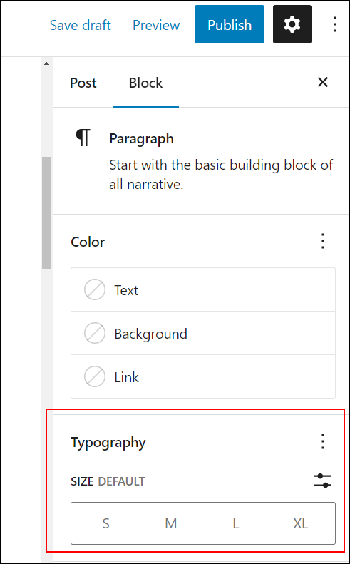
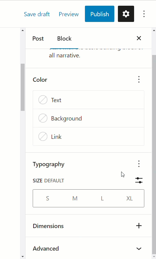
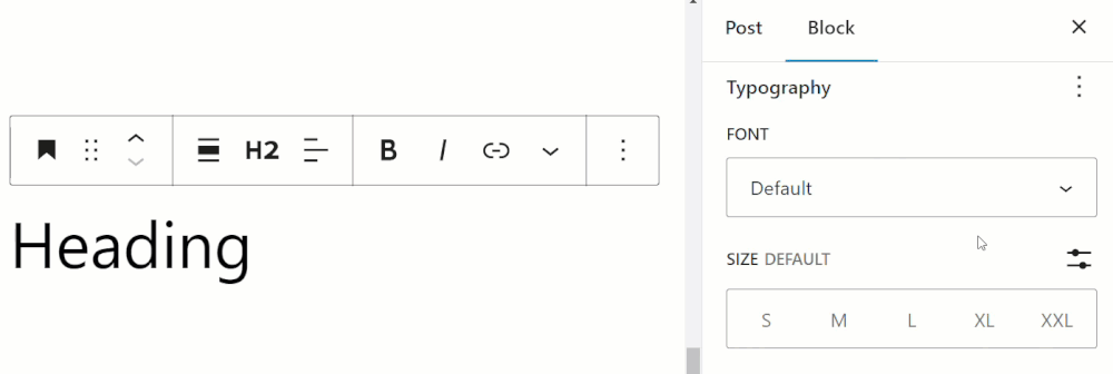
When you click on a block that supports typography, you may only see the default setting “Font Size” displayed in the Block Settings panel.
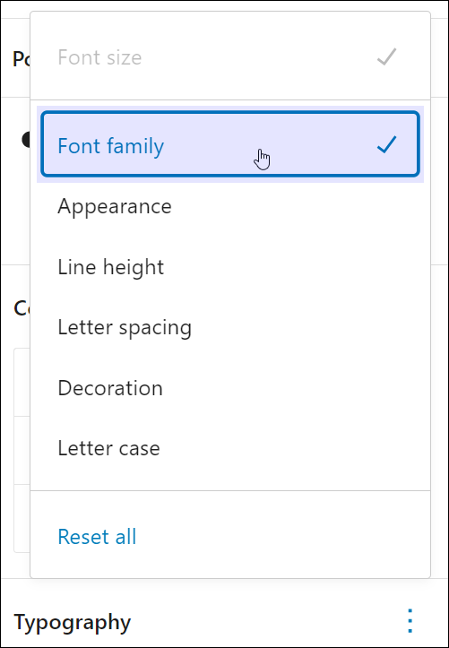
To view all the available typography options, click on the ellipsis icon (3 vertical dots) in the top right-hand section of the panel.
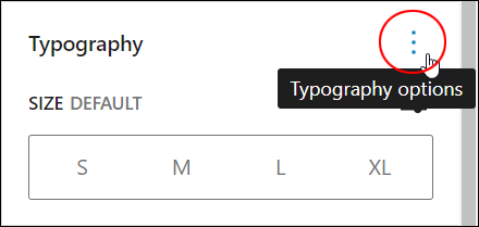
This will bring up a list of all the available options you can select to edit the typography settings for the block.
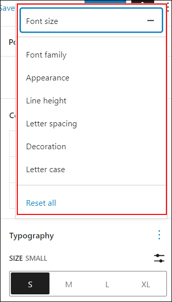
Go through and select the options you’d like to make visible in the Typography settings panel.
Global Typography Settings
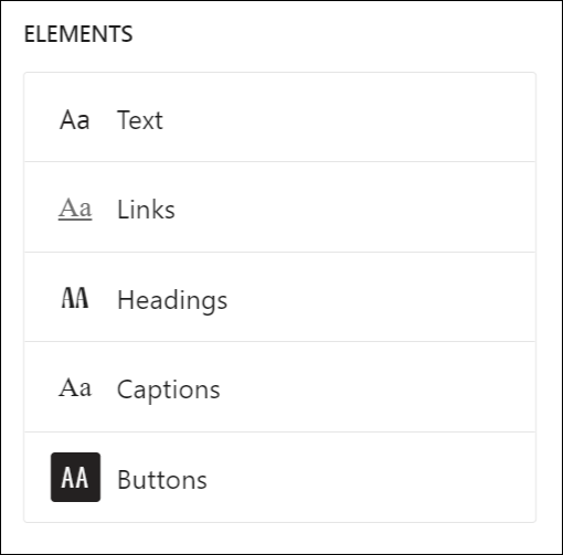
In addition to changing fonts and typography settings in indivudal blocks, you can also make global styling changes to typography settings for fonts and elements like:
- Body text
- Links
- Headings
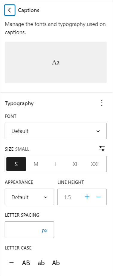
- Captions
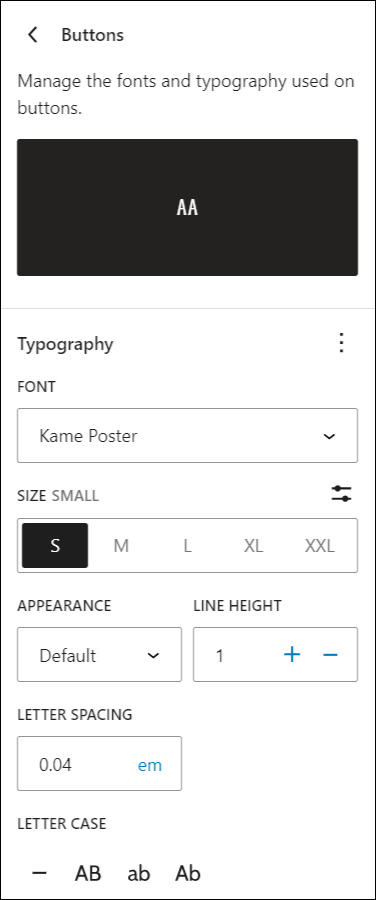
- Buttons
For example, you can add custom fonts and change the typography of your entire site…

And easily style the typography of different elements throughout your entire site.
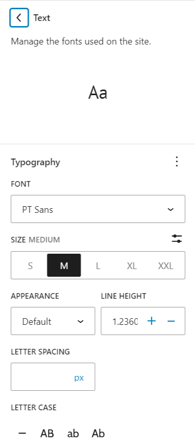
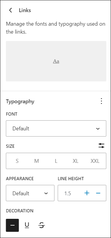
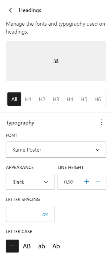
To change the typography of an element, simply click on it…
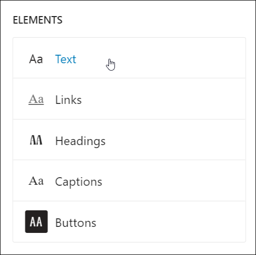
And customize the settings for that element.
You can do the same for links…
Headings…
Captions…
And buttons.
To learn more about changing global typography settings, see this tutorial: WordPress Block Settings: Styles
Typography Settings: Font
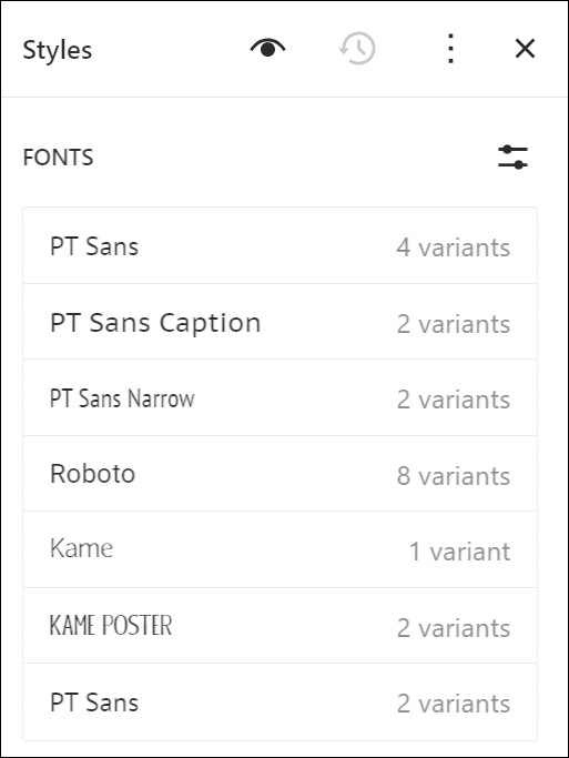
To learn how to add new font styles or change the fonts used on your site, see this tutorial: Using The WordPress Font Library.
Typography Settings: Font Size
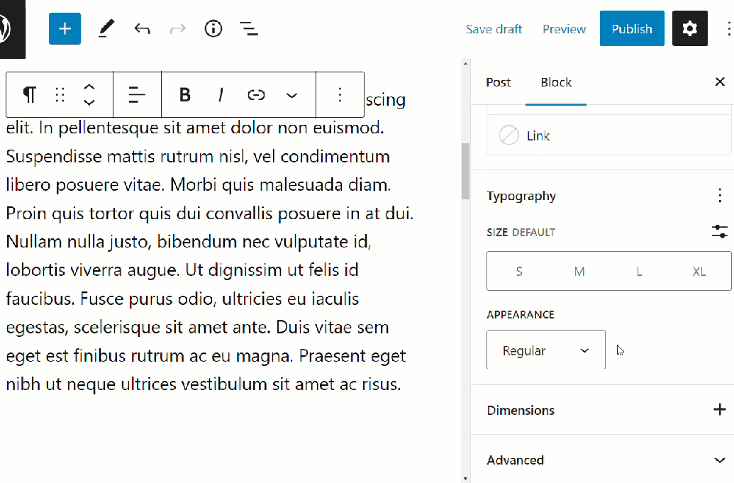
Font Size is the default option for blocks that support typography settings.
You can change font size using a preset size or set a custom font size.
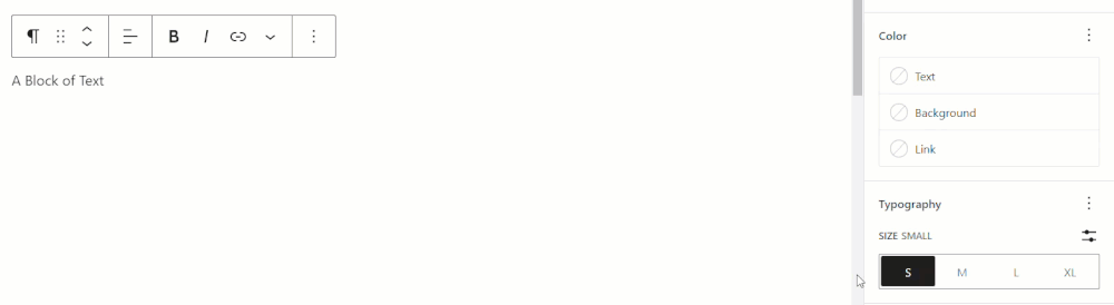
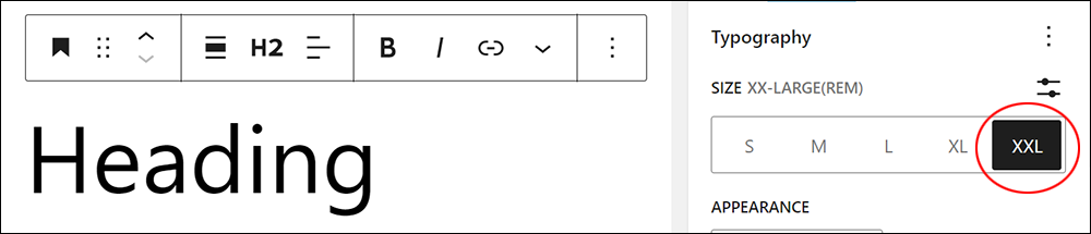
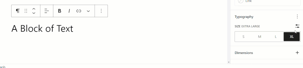
Change Font Size Using Preset
To edit font size settings for a block using the preset selector:
- Select the block.
- Select the Block settings panel to view the Typography settings option.
- Click on the various Size options in the preset selector to change the text’s font size to one of the following options:
- S – Small
- M – Medium
- L – Large
- XL – Extra Large
- XXL – XX Large (displays in some blocks)
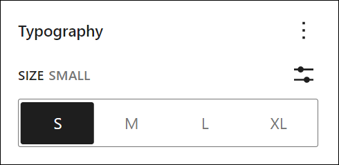
As you click on each of the options in the Font Size selector, the content editor’s live preview shows the font size of your text automatically increasing or decreasing on your screen.
Notes:
Some blocks include an XX-Large preset (other blocks may include additional preset sizes).
Font sizes are responsive, so if you reduce the size of the screen you are working on, font sizes will reduce to fit the screen and you may not notice some font size changes.
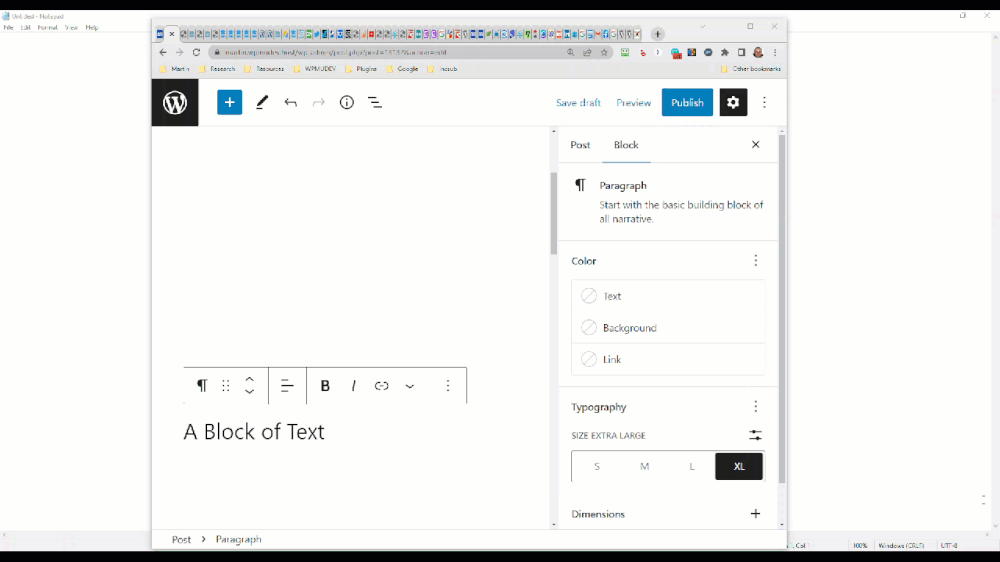
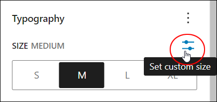
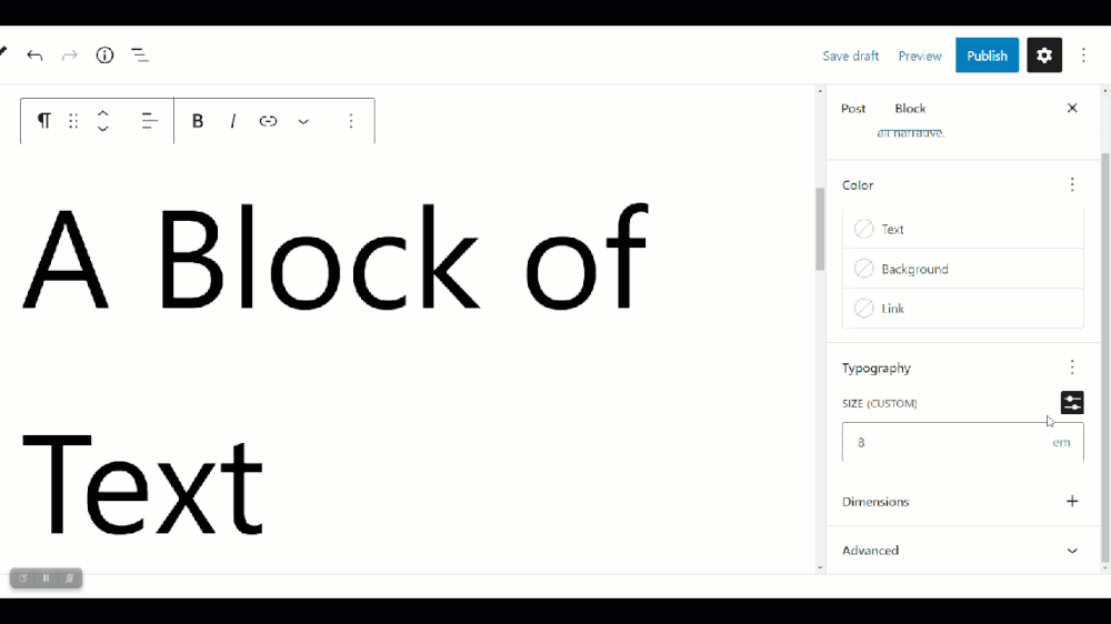
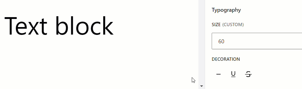
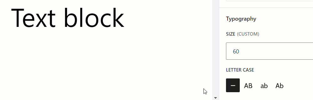
Set Custom Font Size
To set a custom font size for a block:
- Select the block.
- Select the Block settings panel to view the Typography settings option.
- Click on the Set custom size icon to bring up the Custom Size field.
- Choose one of the following custom field properties:
- px – sets the font size in pixels
- em – sets the font size in em units
- rem – sets the font size in rem units
- Enter a custom size value
Here’s the Set custom size icon…
Here is an example of setting a custom font size in the Typography > Font Size settings field…
Note: The ‘Set custom size’ button changes to ‘Use size preset’ after being clicked.
To undo your custom font changes, click on the Use size preset option and select a preset font size.
Remember to save your work after making changes to update your block’s settings.
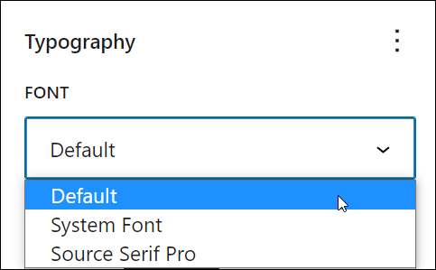
Typography Settings: Font Family
The Font Family option lets you change the font used in your block.
To changes fonts, do the following:
- Select the block.
- Select the Block settings panel to view the Typography settings box.
- Enable the Font Family option in Block Settings > Typography Options.
After enabling the Font Family option, select a font from the Font dropdown menu.
Note: WordPress displays basic font choices (e.g. Default, System Font, and Source Serif Pro) unless your site includes 3rd-party blocks, plugins, and themes that add more font choices to the Font menu.
If you are using a WordPress Block Theme, you can install and add custom fonts to your site using the WordPress Font Library.
The live preview section of the content editor shows changes to the text as you select different fonts.
Remember to save your work after making changes to update your block’s settings.
To learn how to install and use custom fonts in WordPress see this tutorial: WordPress Font Library
Typography Settings: Appearance
The Appearance option lets you select different font typefaces, font styles, or font weights used in your block.
To choose a different font appearance, do the following:
- Select the block.
- Select the Block settings panel to view the Typography settings box.
- Enable the Appearance option in Block Settings > Typography Options.
After enabling this option, select a different style for your font from the Appearance dropdown menu.
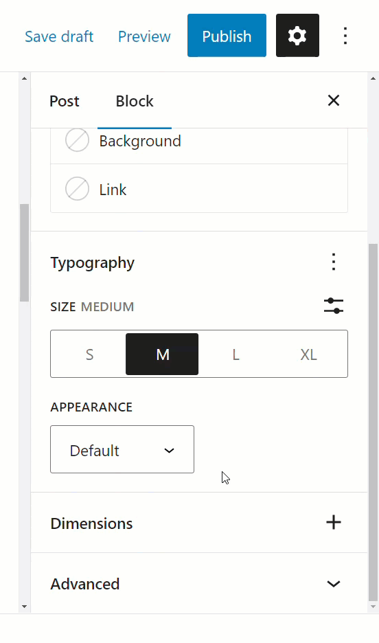
You can preview changes to your font appearance selection as you go.
The menu includes the following options:
- Default
- Thin
- Extra Light
- Light
- Regular
- Medium
- Semi Bold
- Bold
- Extra Bold
- Black
- Thin Italic
- Extra Light Italic
- Light Italic
- Regular Italic
- Medium Italic
- Semi Bold Italic
- Bold Italic
- Extra Bold Italic
- Black Italic
Note: Installing 3rd-party blocks, plugins, and themes on your site may add more options to the Appearance menu.
Remember to save your work after making changes to update your block’s settings.
Typography Settings: Line Height
The Line Height option lets you adjust the line height of text in your block.
To adjust the line height, do the following:
- Select the block.
- Select the Block settings panel to view the Typography settings box.
- Enable the Line height option in Block Settings > Typography Options.
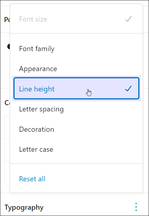
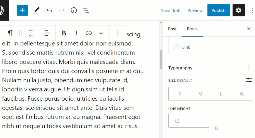
After enabling this option, enter different values in the line height field by either typing it in or moving the up and down arrows.
You can preview the changes to the line height of the text as you make adjustments to the settings.
Note: If you select zero, make sure to check your site on a mobile device.
Remember to save your work after making changes to update your block’s settings.
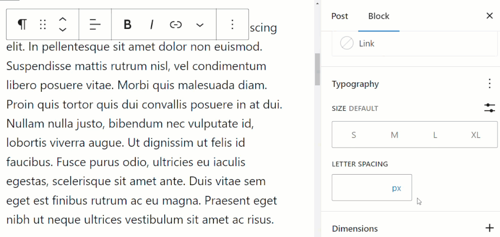
Typography Settings: Letter Spacing
The Letter Spacing option lets you adjust the spacing of text used in your block.
To adjust the letter spacing of your text, do the following:
- Select the block.
- Select the Block settings panel to view the Typography settings box.
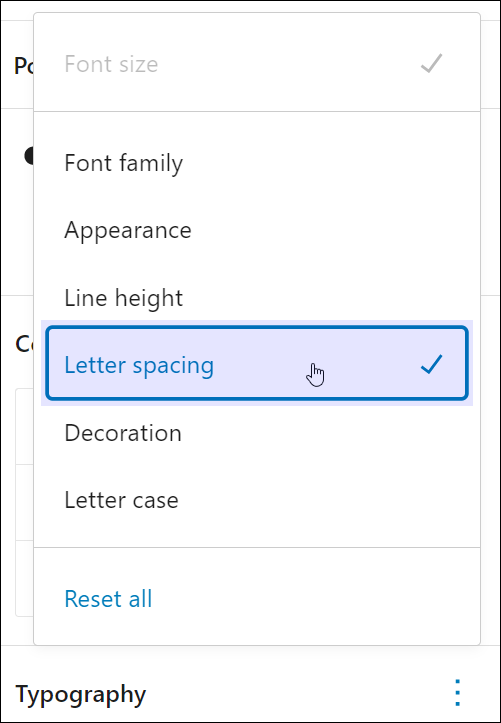
- Enable the Letter spacing option in Block Settings > Typography Options.
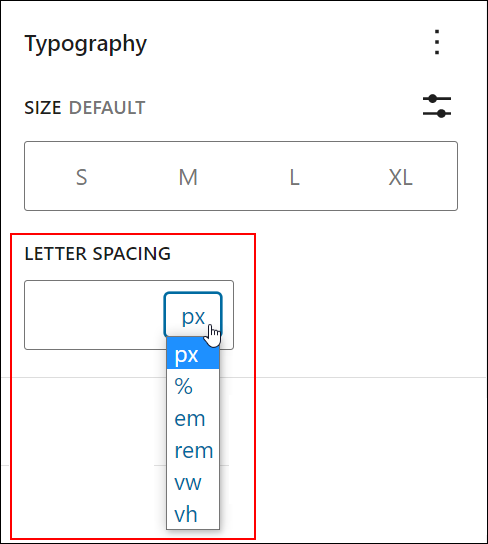
After enabling this option, select a property for your letter spacing values (px, %, em, rem, vw, vh) – see the beginning of this tutorial for an explanation of these settings.
Input values into the Letter Spacing field. The block editor’s live preview feature updates the text as you make your adjustments.
Note: To restore letter spacing to its defaults, simply delete all values in the Letter Spacing field and hit the enter key.
Remember to save your work after making changes to update your block’s settings.
Typography Settings: Decoration
The Decoration option lets you add effects to words in your block text like underlining and strikethrough.
To use this option, do the following:
- Select the block.
- Select the Block settings panel to view the Typography settings box.
- Enable the Decoration option in Block Settings > Typography Options.
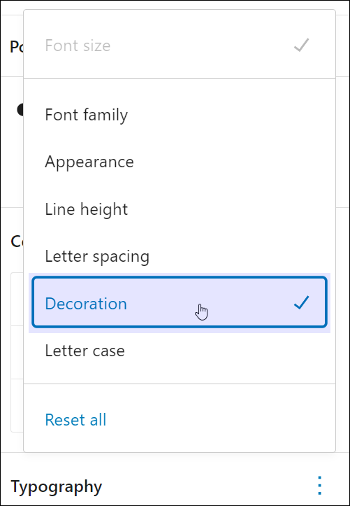
After enabling this option, highlight a word or sentence and click on the decoration symbol to apply the effect.
Your decoration options are:
- None – Restores default text
- Underline – Underline selected text
- Strikethrough – Cross out selected text
Remember to save your work after making changes to update your block’s settings.
Typography Settings: Letter Case
The Letter Case option lets you capitalize text in your block.
To add capitalization to text in your block, do the following:
- Select the block.
- Select the Block settings panel to view the Typography settings box.
- Enable the Letter case option in Block Settings > Typography Options.
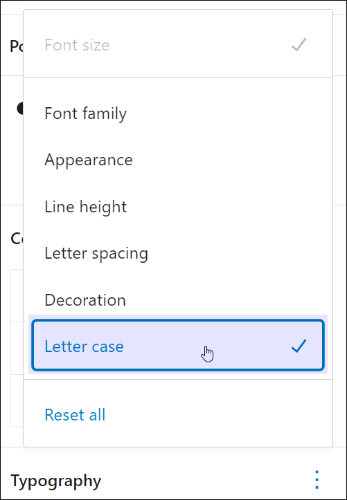
After enabling this option is enabled, select a capitalization style for your text by clicking on the presets.
The default options are:
- None (—) – Restores text to default.
- Uppercase (AB) – Applies uppercase formatting (ALL CAPS) to your text.
- Lowercase (ab) – Applies lowercase formatting to your text.
- Capitalize (Ab) – Capitalizes the first letter of all words in your text.
Remember to save your work after making changes to update your block’s settings.
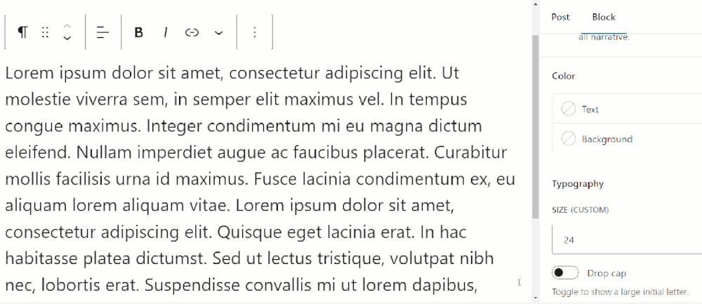
Typography Settings: Drop cap
Some blocks display a Drop Cap option in the Typography settings. This option lets you add a large initial letter to your text.
To add a drop cap to text (when this option is available), do the following:
- Select the block.
- Select the Block settings panel to view the Typography settings box.
- Enable the Drop cap option in Block Settings > Typography Options.
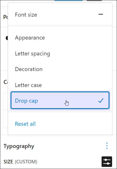
After enabling this option, you will see an on-off toggle for the drop cap feature. Switch the feature on to add the drop cap to your text.
Remember to save your work after making changes to update your block’s settings.
Resetting Typography Options To Default Settings
You can reset your typography properties to their default state individually or all at once.
To reset your block settings, click on the ellipsis symbol on the right-hand side of the Typography settings box.
Do the following:
- If you have made changes to the font size, you will see a “dash” symbol next to the option title. Click on the dash to restore your font size to its default settings and the dash will turn into a ‘tick’.
- To reset and hide any other options, click on the item to remove the ‘tick’ symbol. This will restore any formatting applied to that option.
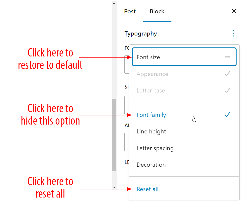
To reset all settings to their default state, click on Reset all.
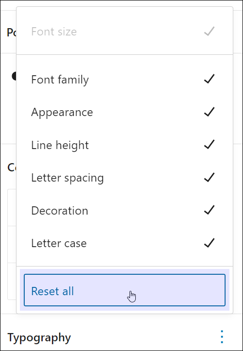
All typography options for the block will be reset to their default state.
WordPress Block Editor Typography Settings – FAQs
Here are frequently asked questions about WordPress Block Editor Typography settings:
What are typography settings in the WordPress Block Editor?
Typography settings control the appearance of text blocks in the Block Editor, including font family, font size, line height, letter spacing, and text alignment.
How can I change the font of text in the Block Editor?
To change the font of text in the Block Editor, select the text block, then navigate to the typography settings in the block sidebar. From there, you can choose the desired font family from the available options.
Can I adjust the font size of text in the Block Editor?
Yes, you can adjust the font size of text in the Block Editor. Simply select the text block and locate the font size setting in the typography settings panel. You can either choose from preset font sizes or enter a custom font size.
Is it possible to change the line spacing of text in the Block Editor?
Yes, you can change the line spacing of text in the Block Editor. Look for the line height setting in the typography settings panel of the text block. Adjusting the line height will change the spacing between lines of text.
How do I align text in the Block Editor?
To align text in the Block Editor, select the text block and find the text alignment options in the typography settings panel. You can choose from left, center, right, or justified alignment to adjust the alignment of the text.
Do WordPress themes affect typography settings in the Block Editor?
Yes, WordPress themes can influence typography settings in the Block Editor by providing default styles for text blocks. Some themes may also offer additional typography customization options through theme settings or customization tools.
***
Congratulations! Now you know how to adjust your block’s typography settings.
Additional Block Settings
Click on a tutorial from the list below to learn about using other common block settings in the WordPress block editor.
***
For more tutorials in this series, go here:
- The WordPress Block Editor (Gutenberg)
- How To Use WordPress Blocks
- How To Use The WordPress Block Editing Toolbar
- How To Use The WordPress Block Editor Content Area
- How To Use The WordPress Block Editor Settings Section
- WordPress Block Editor: Block Settings
***

Updated: July 5th, 2024