
Content Marketing With WordPress – Using Infographics

This tutorial is part of our series on using content marketing to create more exposure online for your business and drive more traffic to your site.
Subscribe to our web content creation course and learn how to never run out of great content for your website, blog, or newsletter.
***
In this tutorial, we look at incorporating the use of infographics into your content marketing mix.
For additional information about adding images to WordPress, see this tutorial: How To Add And Format Images In WordPress
About Infographics
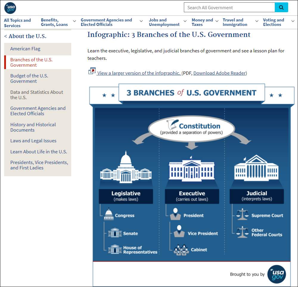
An infographic (information graphic) is an ideal way to share complex statistics and information in an easy to read graphic format.
Infographics are useful, if, for example, you create a research-filled report or, you want to share complex information with a broader audience. Great infographics have the potential to get shared virally and can help drive a lot of traffic to your site.
So, what content should you put on an infographic?
First, you want to identify the topic of your infographic. In addition to finding a topic that appeals to your target audience, you want a topic that provides a lot of research data and statistics, and you want data from a reputable source.
Here are some reputable and trustworthy places to look online for data and statistics:
- A recognized university
- Academic publishers
- News organizations
- Government websites
- Trusted market research companies (e.g. Gartner.com, Forrester Research, etc.)
- Google Scholar
Some of the types of data that display well on infographics can be uncovered by asking questions such as:
How many?
For example:
- How many people ride bikes to work each day?
- How many people overdose on sleeping tablets each year?
- How many marriages from people who met on dating sites have ended in divorce after the first 5 years?
How much?
For example:
- How much of a middle-income family’s budget is spent each month on subscription services for entertainment?
- How much do scuba diving enthusiasts spend each year on diving equipment?
- How much do different types of family cars cost?
What percentage?
For example:
- What percentage of women with university degrees earn a seven-figure income?
- What percentage of small businesses advertise in their local newspaper?
- What percentage of school leavers find a job within the first three months of leaving school?
What’s the average?
- What’s the average cost of renting in different cities around the country?
- What’s the average age of people declaring bankruptcy?
- What’s the average number of times families dine out per week?
How long?
- How long do people with medical careers take to pay off their student loans?
- How long do different types of pets live?
- How long does it take to get from A to B using different transport methods?
Once you have a list of questions and trustworthy places where you can find the answers, the next step is to make sure that you can represent this information in as concise a manner as possible. Basically, you want to be able to create a chart with a few words and numbers to match.
For example, if you wanted to create an infographic showing the life expectancy of pet birds, your list could look something like this:
- African Grey Parrot – 50
- Budgerigar – 18
- Chicken – 15
- Cockatiel – 32
- Domestic Pigeon – 26
- Galah – 26
- Parrot – 80
- Pheasant – 18
- Quail – 6
- Rosella – 15
- Sulphur Crested Cockatoo – 40
- Toucan – 6
- Zebra Finch – 17
You also want to collect any fun, surprising, and unusual data about your topic that would surprise or at least raise eyebrows in your audience (e.g. did you know that Macaws can outlive their owners? Macaws can live 100+ years.)
Having really surprising and interesting data is one of the key ingredients that can make an infographic get shared around virally.
After gathering all of your information, check your data thoroughly. The last thing you want to have is an infographic “fail” that goes viral because it contains wrong (or worse, ridiculous) data. For example, while researching the life expectancy of birds, I came across a site stating that the average lifespan of a swan is 102 years. While there is a seemingly reliable record from a zoo that shows that one individual swan lived to 102 years, this is extreme – swans live on average between 20-30 years.
Once you’ve gathered everything you need for your infographic, the last step is to decide on the design. How you assemble your data visually is extremely important.
The whole point of the infographic is to present information in as visually exciting a manner as possible. You might decide to use a graphic element to draw attention to the text or use it to represent the data itself.
For example, in the infographic dealing with the life expectancy of birds, you could use different silhouettes for each bird, where the longer the life expectancy of the bird, the larger the silhouette would show, represented proportionally when compared to the lifespan of other birds. Also, you could group different life expectancy ranges using different colors (e.g. “red” for birds that live less than 10 years, yellow for birds that live between 10 and 20 years, and green for birds that live more than 20 years.)
You could then arrange all of the silhouettes in an exciting way (e.g. all of them perched on different branches of a giant tree occupying the center of the graphic), with the type of bird and age expectancy displayed next to each silhouette.
The last important element of your design, is to create a catchy title or headline for your infographic (e.g. “Will Your Pet Bird Outlive You?”)
When representing your data visually, you want your reader’s imagination to get “fired up” so they can really understand your message. Here are some ideas for representing data in a visually exciting way:
- If you’re talking about amounts of money, show how much space that money would take to fill related graphic images. For example, if you are showing someone the cost of buying an expensive sports car, you can show how many average family cars that money could buy for the same amount of money, or if you are talking about the wealth of a certain class of people, show how many sports cars or family cars they could buy with their monthly earnings.
- If you’re talking about lengths or large quantities, show how far it would stretch out, or how many states of a country it would occupy, etc. For example, a common comparison that is often used is how many times something would wrap itself around the earth if the total amount of that thing being consumed each year was laid down end-to-end.
Use the same type of comparisons if talking about size (big or small, tall or short), speed (fast, slow), populations (dense, sparse), and so on.
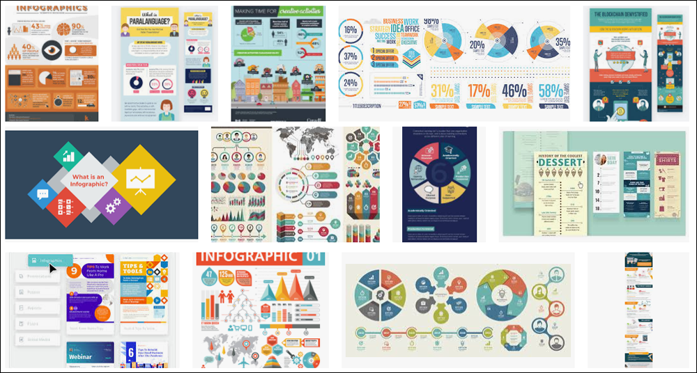
There are many ways to represent data in an infographic. Your design needs to be interesting and memorable, but it really will depend on the topic.
Infographic Resources
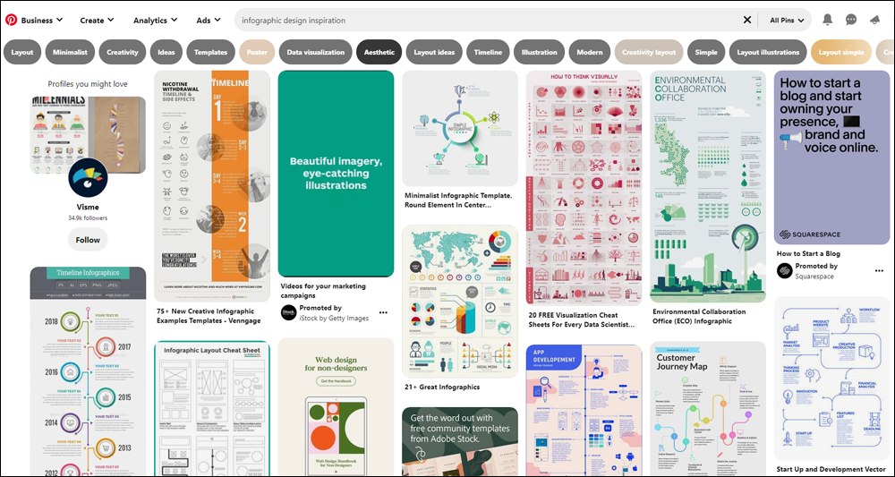
These resources can help you brainstorm ideas for creating your own infographics:
- pinterest.com
- coolinfographics.com
- dailyinfographic.com
- infographicsarchive.com
- infographicjournal.com
- infographicsshowcase.com
Once you have done all your planning, the last step is to create your infographic.
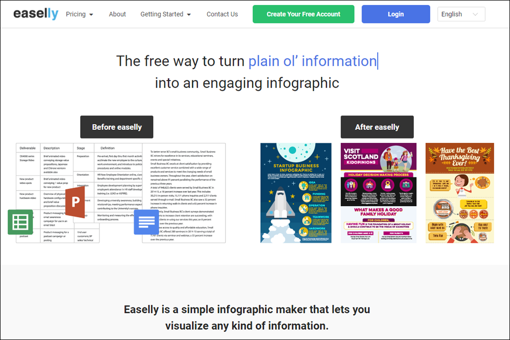
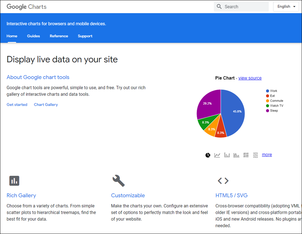
You can use image editing tools like Adobe Photoshop and Adobe Illustrator to create infographics, as long as you also have a large collection of graphic elements like icons, charts and other elements to help you save time. If not, you can get a graphic designer to create the infographic for you or choose from a number of free or low-cost infographic creation tools available online.
Here are some infographic tools you can check out:
Check out these additional infographic creation sites, tools, and resources:
Here’s another useful tool to check out…
Kudani
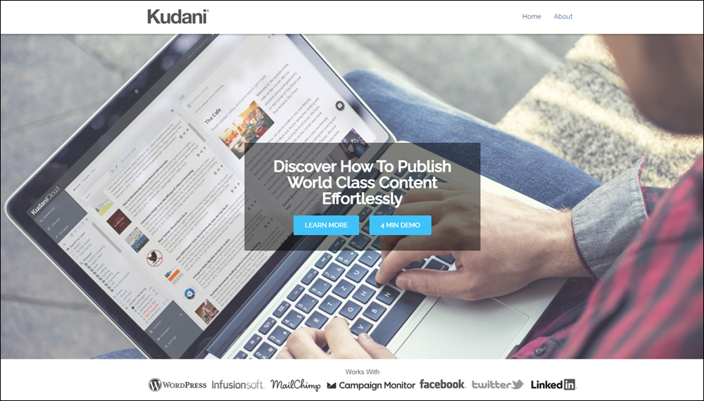
Kudani is a complete content marketing tool that lets you create professional infographics and integrate these with keyword research, curated content, social media promotions, plus manage workflows and schedule content production.
To learn more about Kudani, go here: Kudani
Content Marketing With Infographics – FAQs
Here are frequently asked questions about content marketing with infographics:
What is an infographic and why is it important in content marketing?
An infographic is a visual representation of information, data, or knowledge intended to present information quickly and clearly. They are important in content marketing because they can simplify complex information, making it more digestible and engaging for the audience.
How can infographics enhance my content marketing strategy?
Infographics can boost engagement, increase website traffic, and improve SEO by making content more shareable and visually appealing. They are excellent tools for storytelling and can help convey your message in a memorable way that text alone may not achieve.
What types of information are best conveyed through infographics?
Information that is best conveyed through infographics includes statistical data, timelines, processes, hierarchies, or comparisons. Infographics are particularly effective for presenting data-driven content, survey results, or step-by-step guides.
How do I create an infographic for my WordPress site?
To create an infographic, start by defining your objective and target audience. Gather and organize your data, then use tools like Adobe Illustrator or free online platforms like Canva to design your infographic. Once created, you can easily upload and integrate it into your WordPress site using the media upload feature.
What are the best practices for designing effective infographics?
Keep it simple and focused. Use a limited color palette and clear typography to ensure readability. Organize data logically and visually guide the viewer through the content. Always include sources for your data to enhance credibility.
How can I ensure my infographics are SEO-friendly?
Use relevant keywords in the title, description, and alt text of the infographic file when uploading it to WordPress. Ensure the surrounding content is optimized for SEO and includes a textual description of the infographic’s content to help search engines understand and index it properly.
Can infographics be used for more than just blog posts?
Absolutely, infographics can be utilized in presentations, reports, newsletters, and social media posts. They are versatile tools that can enhance nearly any form of content by making it more engaging and shareable.
Summary
A picture is worth a thousand words. Infographics are a great way for readers to absorb information. Great infographics are also many times more likely to be shared online than articles.
Action Step
Set a goal that you will commit to creating at least one infographic for your business. You will see that the process is fun and the finished product can help drive new traffic to your website. Once you have created your infographic, make sure to post it on your blog and on sites like Pinterest, Facebook, LinkedIn, etc.
This ends the tutorial on using infographics.
To learn about marketing your business using podcasts, see this tutorial: Content Marketing With WordPress – Using Podcasts
For additional tutorials in our series on content marketing with WordPress, go here: Content Marketing With WordPress
***

Updated: July 5th, 2024